Iris Flower Classification Using Machine Learning in Python
Dive into machine learning with the Iris dataset classification project - it's like the "Hello World" for budding data scientists using Python. This project revolves around 150 samples of three Iris species that look alike but have subtle differences in their measurements.

We're going to use Python and some machine learning models to figure out which flower is which. Our goal? To predict if a flower is a Setosa, Versicolor, or Virginica based on its petal and sepal measurements. It's like being a botanical detective.
This guide is perfect for newcomers to machine learning. I've taken inspiration from various tutorials, added my own twists, and worked through challenges to create a learning journey.
Here's what we'll tackle:
- Get the Python workspace ready and bring in the dataset.
- Put on data scientist hats to understand what we're working with.
- Create six different ML models and pick the star performer.
- See how well our chosen model can predict flower types.
Let's get started.
1. Setup the Environment
Make sure the following packages are installed in your environment:
- NumPy for computational operations with arrays, matrices, and linear algebra.
- Pandas for data manipulation and analysis.
- Seaborn which builds on Matplotlib and Pandas for creating statistical data visualizations.
- Matplotlib for creating statistical plots.
- Scikit-Learn which includes a diverse set of supervised and unsupervised machine learning algorithms for classification, regression, clustering, dimensional reduction, model selection, and preprocessing.
Import Libraries and Load the Dataset
Create a new Python file, and import the libraries for analysis and model building:
# Import Libraries
import numpy as np
import pandas as pd
import seaborn as sns
import matplotlib.pyplot as plt
# Load Modules, Functions, Objects
from sklearn.model_selection import train_test_split
from sklearn.model_selection import cross_val_score
from sklearn.model_selection import StratifiedKFold
from sklearn.metrics import classification_report
from sklearn.metrics import confusion_matrix
from sklearn.metrics import accuracy_score
from sklearn.discriminant_analysis import LinearDiscriminantAnalysis
from sklearn.neighbors import KNeighborsClassifier
from sklearn.tree import DecisionTreeClassifier
from sklearn.naive_bayes import GaussianNB
from sklearn.svm import SVC
from sklearn.ensemble import RandomForestClassifier
Create a variable “col_names” to label the columns in the CSV based on the Iris data information. Then, import the CSV file from local storage as a Pandas DataFrame called variable “df” using the read_csv() method:
# Load the Dataset into a DataFrame
col_names = ['Sepal Length', 'Sepal Width', 'Petal Length', 'Petal Width', 'Class']
df = pd.read_csv("iris.csv", names = col_names)
Congratulations, the environment is ready to use!
2. Exploratory Data Analysis
Exploratory Data Analysis (EDA) is a process used by data scientists to analyze and investigate datasets before making assumptions. We can summarize the main characteristics of a dataset in terms of patterns, relationships, or anomalies to inform subsequent analysis.
Summarize the Dataset
We’ll obtain the volume and dimensions of the data using the shape() method:
# Summarize the Dataset
print(df.shape)
Output:

The dataset includes 150 rows of data in five columns.
To see if our dataset has the right type of data, we’ll check the first 5 rows of data in each column by using the head() method:
print(df.head())
Output:

This looks like the right type of data for a specific species of Iris! The numerical values are in centimeters.
The info() method prints a concise summary of a DataFrame, including index dtype and columns, non-null values, and memory usage:
print(df.info())
Output:
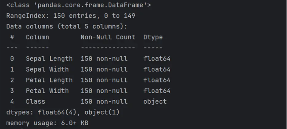
The describe() method generates a statistical description of the data in the DataFrame that summarizes central tendency, dispersion and shape of the dataset’s distribution:
print(df.describe())
Output:
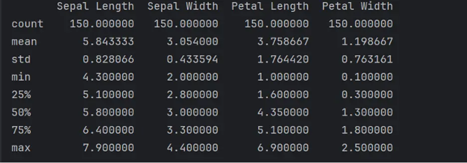
To obtain the frequency of unique rows that belong to each class in the DataFrame, we’ll use the value_counts() method:
print(df['Class'].value_counts())
Output:

Each class of Iris flower has 50 rows of data in the DataFrame.
Create Violin Plots
A violin plot is a statistical graph for comparing the probability distributions and densities between multiple groups in a numeric dataset. The width of each density curve corresponds with the approximate frequency of data points in each region. The shape of each group’s density curve can be compared to see where groups are similar or different.
We’ll use the violinplot() function which is included in the Seaborn library. We’ll create bivariate plots showing 3 violins each, 1 for each species of Iris. We’ll also show interior lines representing the interquartile ranges. The Seaborn color palette is set to Yellow-Green-Blue:
# Create Violin Plots to Compare Variable Distribution
sns.violinplot(y='Class', x='Sepal Length', data=df, inner='quartile', hue='Class', palette="YlGnBu")
# Adjust the plot to ensure all labels are visible
plt.tight_layout()
plt.show()
sns.violinplot(y='Class', x='Sepal Width', data=df, inner='quartile', hue='Class', palette="YlGnBu")
plt.tight_layout()
plt.show()
sns.violinplot(y='Class',x='Petal Length',data=df,inner='quartile',hue='Class', palette="YlGnBu")
plt.tight_layout()
plt.show()
sns.violinplot(y='Class',x='Petal Width',data=df,inner='quartile',hue='Class', palette="YlGnBu")
plt.tight_layout()
plt.show()
Output:
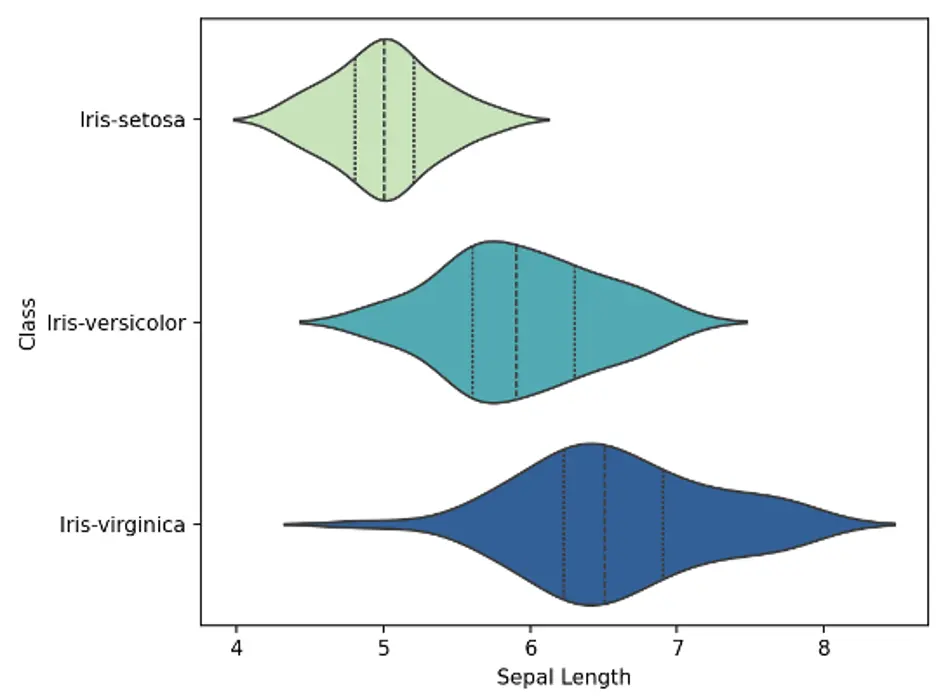
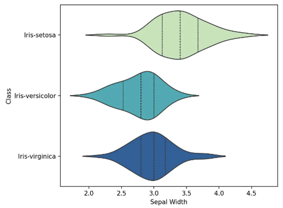
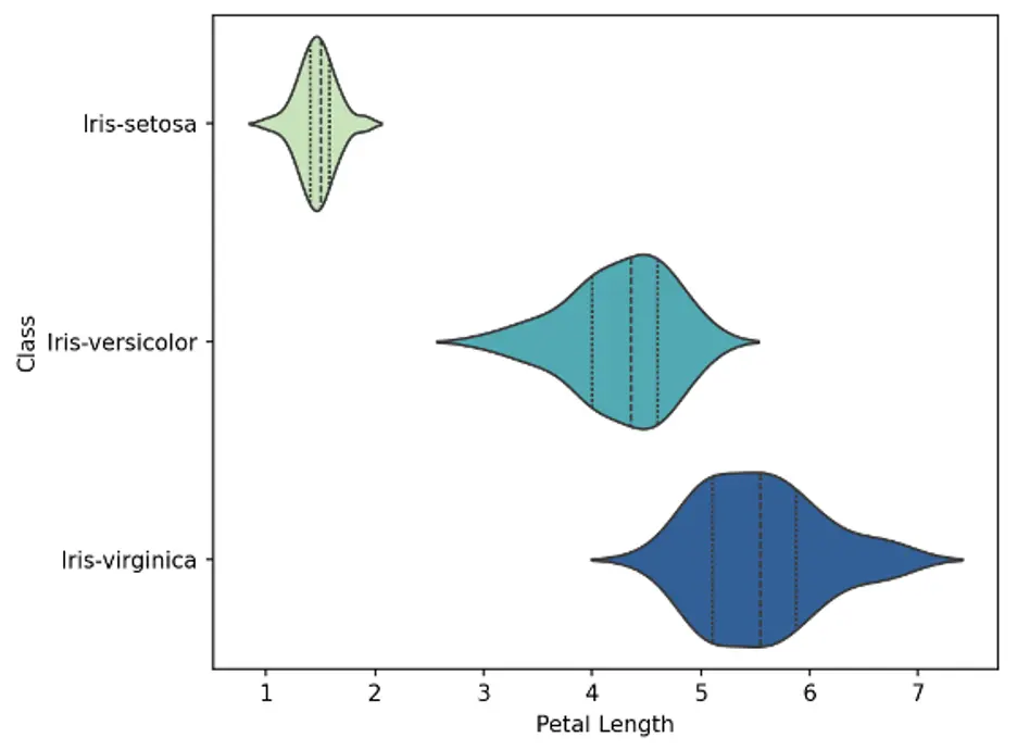
The violin plots show that the density curves of the Iris-setosa species are substantially different from the other species. Sepal length and width for the setosa species are generally shorter and wider, respectively, than the other species, and petal length and width are substantially shorter and narrower, respectively.
Create a Pairs Plot
A pairs plot helps us understand the pairwise relationship between different variables in a dataset. We’ll use the pairplot() function for each species of Iris and use the Yellow-Green-Blue color palette:
# Create Pairs Plot to Check Multiple Pairwise Bivariate Distributions
sns.pairplot(df, hue='Class', palette="YlGnBu")
plt.show()
Output:
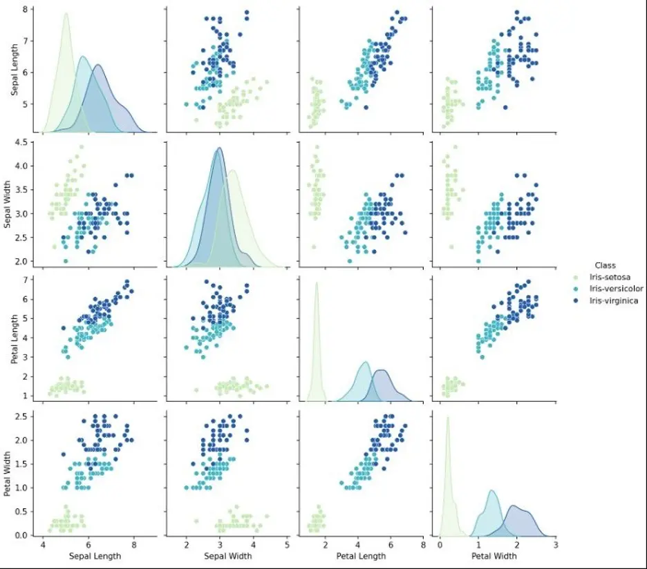
The pairs plot shows that the Iris-setosa species is well separated from the other two species, notably in sepal length, petal length, and petal width. Some of the pairs also show diagonal groupings, suggesting high correlation and predictable relationships.
Create a Heatmap
A heatmap helps to visualize large amounts of data through a cartesian plot of colored rectangular tiles where color intensity represents density data. We’ll use the sns.heatmap() function in Seaborn and the Greens colormap in Matplotlib to create the Heatmap:
# Plot Heatmap to Check Pairwise Correlation
plt.figure(figsize=(7,5))
#Select only numerical columns for correlation calculation
numerical_data = df.select_dtypes(include=['float64', 'int64'])
sns.heatmap(numerical_data.corr(), annot=True, cmap='Greens')
plt.show()
Output:
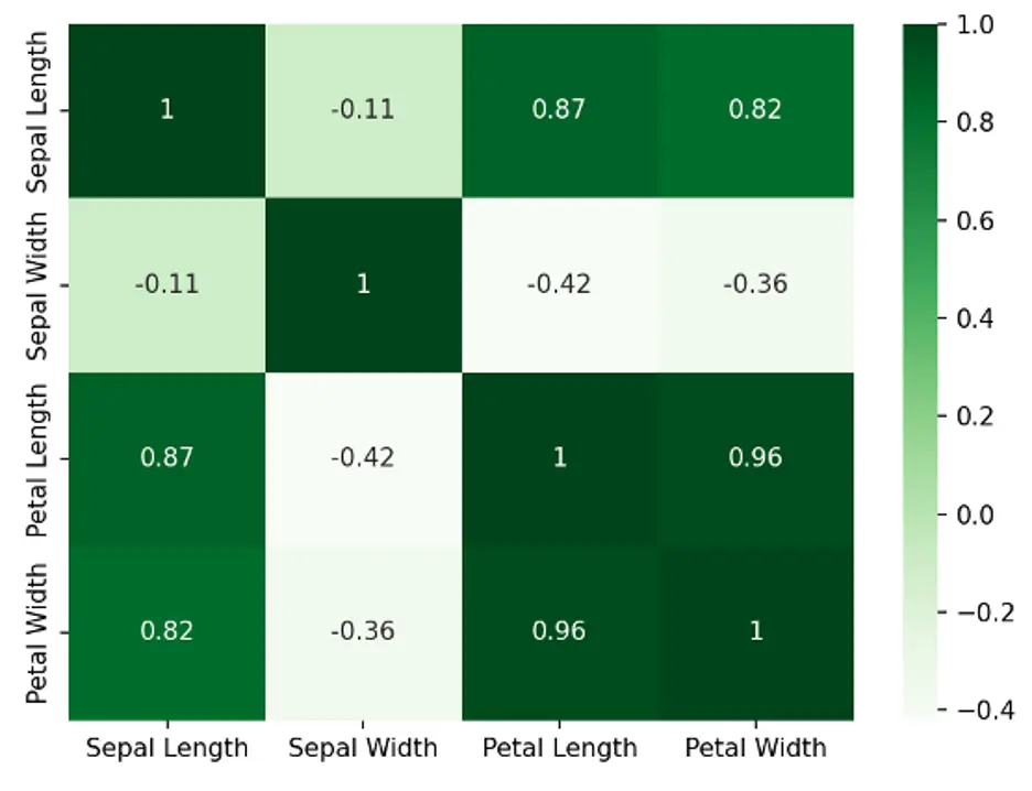
Each square shows the linear correlation between the variables in the dataset, in this case the length and width of sepals and petals. Values range from -1 to +1.
To help interpret the Heatmap:
- Variables are more positively correlated as the values approach 1, showing stronger relationships.
- Variables are less correlated as the values approach 0, showing weaker linear relationships.
- Variables are more negatively correlated as the values approach -1, showing stronger inverse relationships.
The diagonal squares are 1’s because each of those variables is perfectly correlated with itself.
3. Build and Train the Model
We don’t know yet which algorithm would be a good fit for this classification problem, so we’ll test 6 different algorithms:
- Linear Discriminant Analysis (LDA) uses Bayes’ theorem and the assumption that data features are normally distributed to calculate conditional probabilities.
- K-Nearest Neighbors (KNN) uses proximity to make classifications.
- Decision Tree (DT) is based on a hierarchical tree structure (Decision Tree is also known as Classification and Regression Tree)
- Gaussian Naïve Bayes (NB) is also based on Bayes’ Rule but differs from LDA in that it assumes independence of the features.
- Support Vector Machine (SVC) classifies data by calculating a hyperplane that maximizes the distance between data points of each class.
- Random Forest (RF) combines the output of multiple decision trees to reach a single result.
First, we’ll create dependent variable “x” and independent variable “y” where Class is the independent variable:
# Model Building
x = df.drop(['Class'], axis=1)
y = df['Class']
print(f'x shape: {x.shape} | y shape: {y.shape}')
Output:

The “x” variable has 150 rows in 4 columns, and the “y” variable has 150 rows in 1 column. We’ll split the dataset into training and test datasets, with 20% of the raw dataset reserved for validation and 80% for training:
### Split the Dataset into Train and Test Data
x_train, x_test, y_train, y_test = train_test_split(x, y, test_size=0.20, random_state=1)
Next, we’ll run the 6 algorithms against the training dataset and estimate the accuracies of each one so that we can select the best-fit model.
We’ll use Stratified Kfold Cross Validation to split the test data into 10 stratified folds using the StratifiedKFold() function in Sci-Kit Learn, and use those folds to estimate model accuracy. We’ll set the random_state argument to a fixed number so that each algorithm is evaluated on the same splits of the training dataset.
We’ll use the ‘accuracy’ metric to evaluate the models, which is a ratio of the number of correct predictions divided by the total number of instances in the dataset:
# Test Six Different Algorithms in Loop and Print Accuracy
models = []
models.append(('LDA', LinearDiscriminantAnalysis()))
models.append(('KNN', KNeighborsClassifier()))
models.append(('DT', DecisionTreeClassifier()))
models.append(('NB', GaussianNB()))
models.append(('SVC', SVC(gamma='auto')))
models.append(('RF', RandomForestClassifier()))
# Evaluate Each Model
results = []
model_names = []
for name, model in models:
  kfold = StratifiedKFold(n_splits=10, random_state=1, shuffle=True)
  cv_results = cross_val_score(model, x_train, y_train, cv=kfold, scoring='accuracy')
  results.append(cv_results)
  model_names.append(name)
  print('%s: %f (%f)' % (name, cv_results.mean(), cv_results.std()))
Output:

The SVC model generates the largest estimated accuracy score at 98.3333% accuracy.
4. Evaluate Predictions
We’ll use the SVC model to make predictions since, in the previous section, it appeared to be the most accurate model.
We’ll fit the model on the entire training dataset, make predictions, and evaluate them by calculating classification accuracy and showing detailed information about the prediction. To train the SVC model and make predictions:
# Train the SVC Model and Make Predictions on the Test Dataset
svcmodel = SVC(gamma=’auto’)
svcmodel.fit(x_train, y_train)
predictions = svcmodel.predict(x_test)
Now we’ll evaluate the model’s predictions by comparing them to expected results in the test dataset. We’ll estimate the accuracy of the predictions, create a confusion matrix, and generate a classification report.
To evaluate the accuracy of predictions:
# Evaluate Predictions
print(accuracy_score(y_test, predictions))
Output:

The accuracy of the algorithm is about 97% on the test dataset.
A confusion matrix helps to evaluate the performance of the classification algorithm by comparing the predictions and actual class labels for the dataset:
print(confusion_matrix(y_test, predictions))
Output:

This view is not so easy on the eyes, though, so we’ll create a heatmap:
# Plot the Confusion Matrix in a Heatmap
cm = confusion_matrix(y_test, predictions)
# Get Unique ‘Class’ Labels
class_labels = df['Class'].unique()
sns.heatmap(cm, annot=True, fmt='d', cmap='YlGnBu', xticklabels=class_labels, yticklabels=class_labels)
# Rotate x-axis Labels by 45 Degrees for Better Readability
plt.xticks(rotation=45, ha='right')
plt.ylabel('Prediction',fontsize=12)
plt.xlabel('Actual',fontsize=12)
plt.title('Confusion Matrix',fontsize=16)
# Adjust the Plot to Ensure All Labels are Visible
plt.tight_layout()
plt.show()
Output:
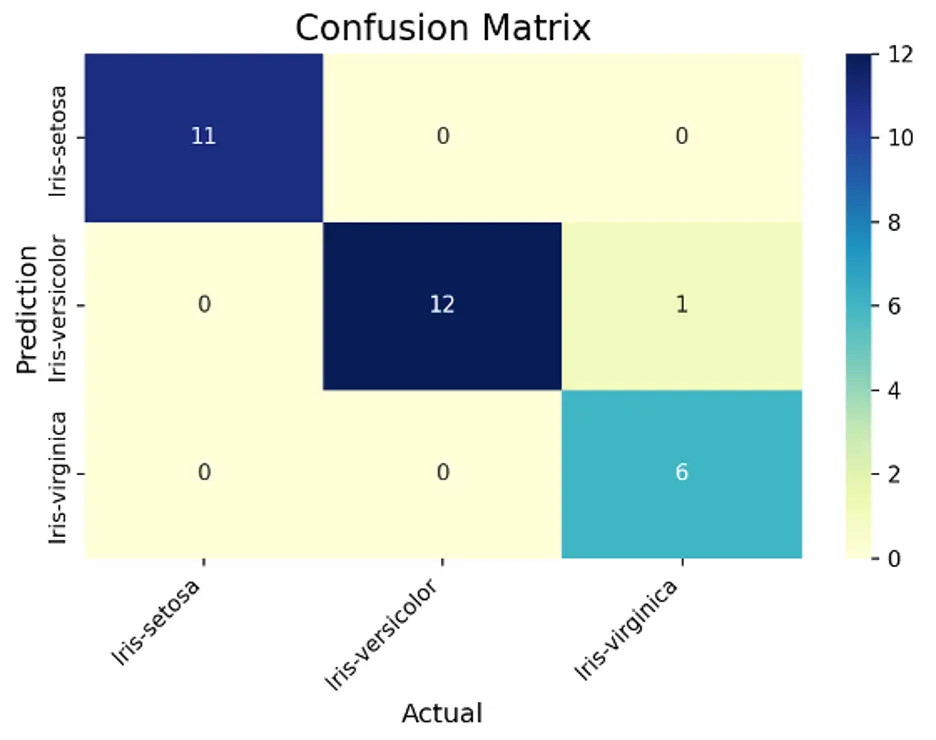
This matrix better visualizes the performance of the model. The diagonal elements show the number of correct classifications (true positives). It correctly predicted all 11 elements of the setosa examples. It correctly classified 12 versicolor instances and misclassified 1 example as virginica. It correctly predicted 6 elements of the virginica examples. The SVC model performed very well!
Now we’ll generate a classification report to provide information on the precision, recall, and accuracy of the model:
print(classification_report(y_test, predictions))
Output:
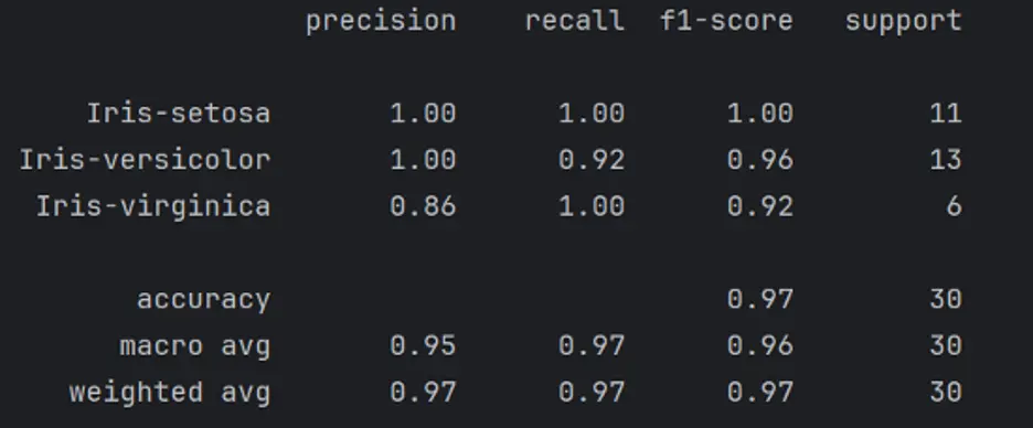
The report shows excellent results.
Here’s a breakdown of the information in the classification report:
- Precision – the percentage of the predictions that were correct. True Positives divided by the sum of True Positives and False Positives.
- Recall – the percentage of the positive instances found correctly.
- True Positives divided by the sum of True Positives and False Negatives.
- F1 Score – the percentage of positive predictions that were correct. 2 times Precision times Recall divided by the sum of Precision and Recall.
- Support – the actual number of occurrences of the class in the specified dataset.
5. Summary and Next Steps
We created a simple ML project from setting up the environment through making classification predictions.
Be sure to work through the tutorial yourself to complete your own ML project in Python.