Forecast Sales Using Machine Learning in Python
Imagine being able to see into the future of your business. That’s what sales forecasting does, and it’s a game-changer for organizations. In this machine learning project, we’re taking on a real-world challenge: predicting Walmart’s weekly sales.
We’ll be diving into historical data from 45 stores, wrestling with holiday promotions, and putting various predictive models through their paces.
Let’s get started.

1. Setup the Environment and Understand the Data
Setup the Environment
The full problem statement and datasets are available from Kaggle:
Kaggle: Walmart-Recruiting Store-Sales-Forecasting
Let’s setup the environment and create DataFrames:
# Import Libraries
import xgboost as xgb
import numpy as np
import pandas as pd
import matplotlib
import matplotlib.pyplot as plt
import seaborn as sns
import joblib
from sklearn.impute import SimpleImputer
from sklearn.preprocessing import MinMaxScaler
from sklearn.preprocessing import OneHotEncoder
from sklearn.ensemble import RandomForestRegressor
from sklearn.metrics import root_mean_squared_error
from sklearn.metrics import mean_squared_error, mean_absolute_error, r2_score
from sklearn.metrics import accuracy_score
from xgboost import XGBRegressor
# Set Display Options
pd.options.display.width= None
pd.options.display.max_columns = None
pd.set_option('display.max_rows', 3000)
pd.set_option('display.max_columns', 3000)
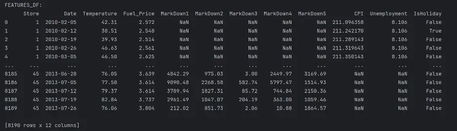
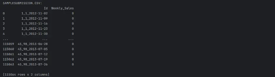
Load the Datasets
Let’s read the datasets in the CSV files into DataFrames and print them out to understand the type of data in the files.
# Load the Datasets into DataFrames and Print the Columns
features_df = pd.read_csv('features.csv')
print("FEATURES_DF:")
print(features_df)
stores_df = pd.read_csv('stores.csv')
print("STORES_DF:")
print(stores_df)
train_df = pd.read_csv('train.csv')
print("TRAIN_DF:")
print(train_df)
test_df = pd.read_csv('test.csv')
print("TEST_DF:")
print(test_df)
submission_df = pd.read_csv('sampleSubmission.csv')
print("SAMPLESUBMISSION.CSV:")
print(submission_df)
Output:
The following dataset descriptions are provided on the Data tab on[Kaggle}(https://www.kaggle.com/c/walmart-recruiting-store-sales-forecasting/data).
“Features.csv: This file contains additional data related to the store, department, and regional activity for the given dates. It contains the following fields:
- Store - the store number
- Date - the week
- Temperature - average temperature in the region
- Fuel_Price - cost of fuel in the region
- MarkDown1-5 - anonymized data related to promotional markdowns that Walmart is running MarkDown data is only available after Nov 2011, and is not available for all stores all the time. Any missing value is marked with an NA.
- CPI - the consumer price index
- Unemployment - the unemployment rate
- IsHoliday - whether the week is a special holiday week
For convenience, the four holidays fall within the following weeks in the dataset (not all holidays are in the data):
- Super Bowl: 12-Feb-10, 11-Feb-11, 10-Feb-12, 8-Feb-13
- Labor Day: 10-Sep-10, 9-Sep-11, 7-Sep-12, 6-Sep-13
- Thanksgiving: 26-Nov-10, 25-Nov-11, 23-Nov-12, 29-Nov-13
- Christmas: 31-Dec-10, 30-Dec-11, 28-Dec-12, 27-Dec-13”
Notice there are several NaN values in the MarkDown, CPI, and Unemployment columns. NaN stands for “Not a Number” and represents missing values. We’ll need to address these gaps to maintain integrity of the analysis.

“stores.csv: This file contains anonymized information about the 45 stores, indicating the type and size of store.”
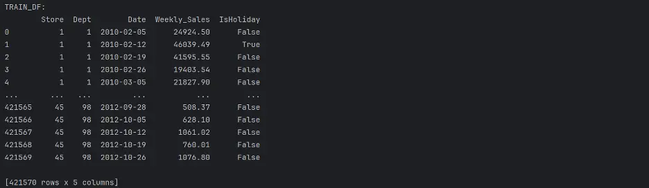
“train.csv: This is the historical training data, which covers to 2010-02-05 to 2012-11-01. Within this file you will find the following fields:
- Store - the store number
- Dept - the department number
- Date - the week
- Weekly_Sales - sales for the given department in the given store
- isHoliday - whether the week is a special holiday week”
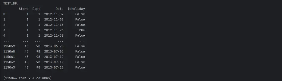
“test.csv: This file is identical to train.csv, except we have withheld the weekly sales. You must predict the sales for each triplet of store, department, and date in this file.”
Combining datasets will allow access to all of the training data in a single DataFrame, so let’s combine features_df with stores_df, and then with train_df and test_df.
Merge features_df and stores_df:
# Merge features_df, stores_df
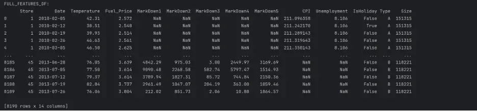
full_features_df = features_df.merge(stores_df, how='inner', on='Store')
print("FULL_FEATURES_DF:")
print(full_features_df)
Output:
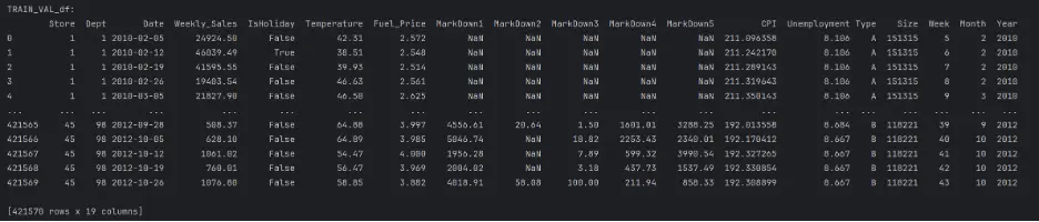
Merge full_features_df and train_df:
# Merge full_features_df, train_df DataFrames
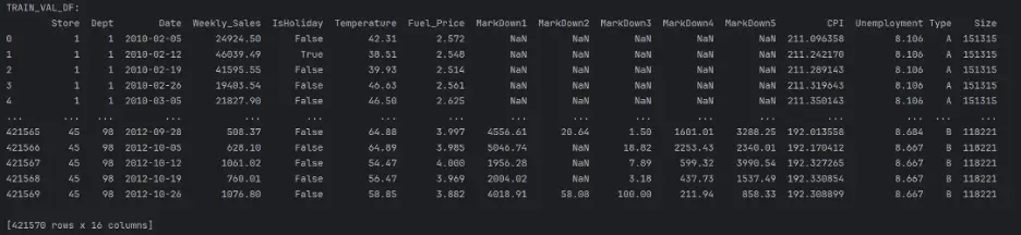
train_val_df = train_df.merge(full_features_df, how='inner', on=['Store', 'Date', 'IsHoliday'])
print("TRAIN_VAL_DF:")
print(train_val_df)
Output:
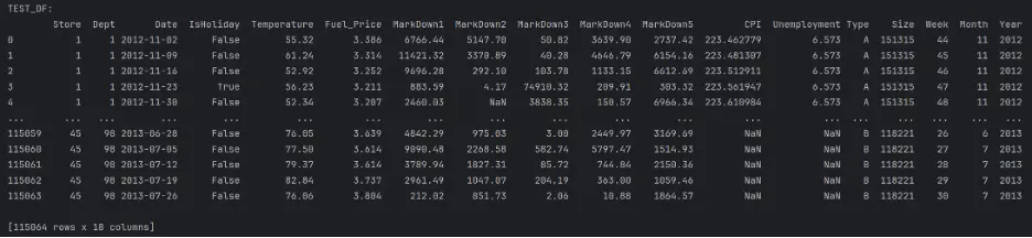
Then merge test_df and full_features_df:
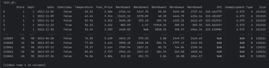
# Merge test_df, full_features_df
test_df = test_df.merge(full_features_df, how='inner', on=['Store', 'Date', 'IsHoliday'])
print("TEST_DF:")
print(test_df)
Output:
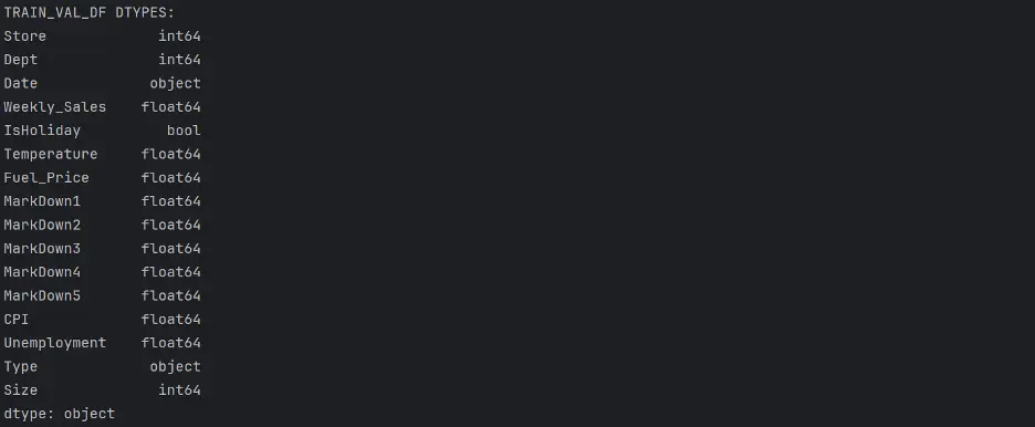
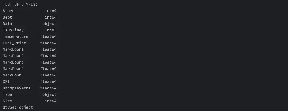
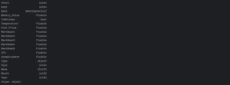
To help us understand the type of data in the datasets, we will check the data type objects (dtypes) in the train_val_df DataFrame and the test_df DataFrame.
# Print dtypes in the train_val_df and test_df DataFrames
del full_features_df, train_df, features_df, stores_df
print("TRAIN_VAL_DF DTYPES: ")
print(train_val_df.dtypes)
print("TEST_DF DTYPES: ")
print(test_df.dtypes)
Output:
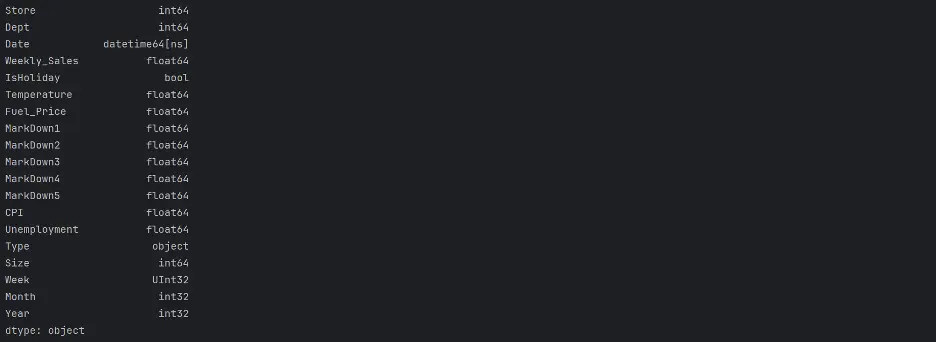
Let’s change the Date column dtype from object to datetime and create new columns for Week, Month, Year values:
# Change Date Column's dtype from object to datetime
train_val_df.Date = pd.to_datetime(train_val_df.Date)
test_df.Date = pd.to_datetime(test_df.Date)
train_val_df['Week'] = train_val_df.Date.dt.isocalendar().week
train_val_df['Month'] = train_val_df.Date.dt.month
train_val_df['Year'] = train_val_df.Date.dt.year
test_df['Week'] = test_df.Date.dt.isocalendar().week
test_df['Month'] = test_df.Date.dt.month
test_df['Year'] = test_df.Date.dt.year
print("TRAIN_VAL_DF:")
print(train_val_df)
print(train_val_df.dtypes)
print("TEST_DF:")
print(test_df)
print(test_df.dtypes)
Output:
2. Exploratory Data Analysis
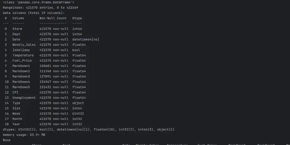
Let’s analyze and investigate the datasets and summarize their main characteristics. This will help to identify any obvious errors and potentially detect relationships between the variables.
The info() method will help to understand the number of columns, column labels, data types, memory usage, range index, and the number of cells in each column.
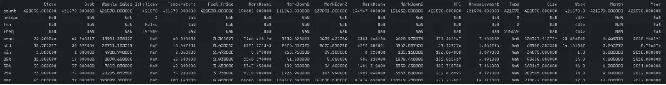
The describe() method will return a statistical description of the data in the DataFrames.
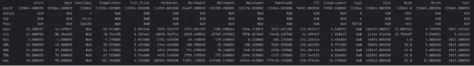
print(train_val_df.info())
print(train_val_df.describe(exclude=['datetime', 'UInt32', 'int32']))
Output:
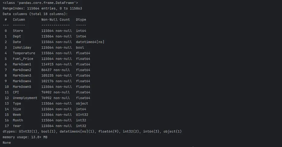
Let's do the same for test_df:
print(test_df.info())
print(test_df.describe(exclude=('datetime')))
Output:
Let’s confirm the unique values in Store and Type in both DataFrames:
# Check Unique Values of Store and Type
print("Unique Value of Store in train_val_df: ", train_val_df['Store'].unique())
print("Unique Value of Type in train_val_df: ", train_val_df['Type'].unique())
print("Unique Value of Store in test_df: ", test_df['Store'].unique())
print("Unique Value of Type in test_df: ", test_df['Type'].unique())
Output:
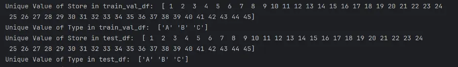
There are 45 different stores present, and three unique types of stores.
Let’s count the unique values in the Year column using the value_counts() method.
print(train_val_df.Year.value_counts())
print(test_df.Year.value_counts())
Output:


We will use visual tools to explore and analyze the datasets, including the relationships between different subsets of variables.
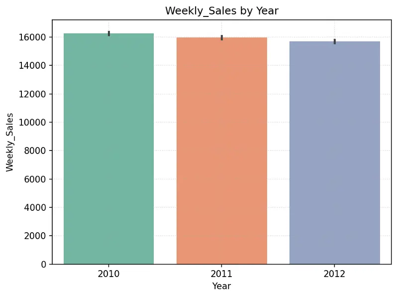
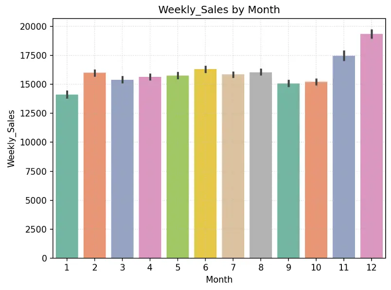
Create chart showing Weekly_Sales by Year and by Month in the training dataset:
# Create Bar Chart Weekly_Sales by Year
fig = sns.barplot(x='Year', y='Weekly_Sales', data=train_val_df, hue='Year', palette="Set2", legend=False)
plt.grid(True, linestyle=':', alpha=0.5)
plt.title("Weekly_Sales by Year")
plt.tight_layout()
plt.show()

# Create Bar Chart Weekly_Sales by Month
fig = sns.barplot(x='Month', y='Weekly_Sales', data=train_val_df, hue='Month', palette="Set2", legend=False)
plt.grid(True, linestyle=':', alpha=0.5)
plt.title("Weekly_Sales by Month")
plt.tight_layout()
plt.show()
Output:
Create pie chart showing % of stores by Type in the training dataset:
# Create Pie Chart % of Stores by Type
plt.figure(figsize=(10,6))
#plt.title("% of Stores by Type",fontdict={"fontsize":20},pad=20)
plt.title("% of Stores by Type")
plt.pie(train_val_df.Type.value_counts(), labels=train_val_df.Type.value_counts().index, autopct='%1.1f%%', colors=sns.color_palette('Set2'))
plt.legend(loc='upper right')
plt.tight_layout()
plt.show()
Output:
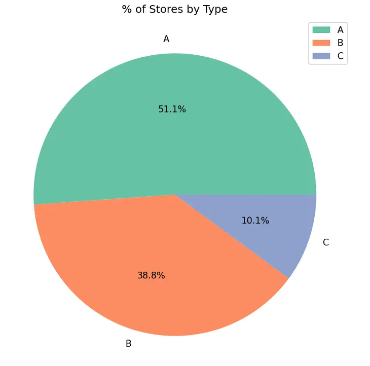
Type A stores make up 51.1% of the total number of stores, followed by Type B stores at 38.8% and Type C stores at 10.1%.
Let’s understand the size of each store type and the weekly sales by store type.
We’ll use a box plot to show the size of the stores by store type. Box plots display the distribution of data and can indicate whether the distribution is symmetrical or skewed. The ends of the box represent the first (lower) quartile and third (upper) quartile. The line inside the box represents the median which is the second quartile. The whiskers extend from the box to represent minimum and maximum values, excluding any outliers.
# Create Box Plot Size of Store Type
data = pd.concat([train_val_df['Type'], train_val_df['Size']], axis=1)
f, ax = plt.subplots(figsize=(8,6))
fig = sns.boxplot(x='Type', y='Size', data=data, hue='Type', palette="Set2")
plt.grid(True, linestyle=':', alpha=0.5)
plt.title(label="Size of Store by Type")
plt.tight_layout()
plt.show()
Output:
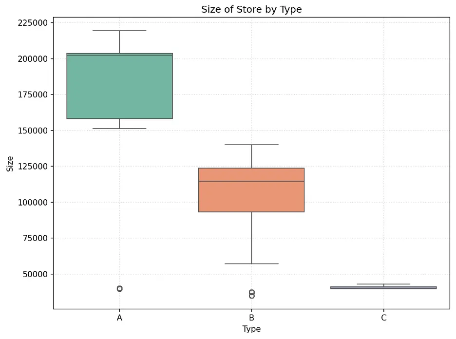
The size of stores is skewed by store type. Type A stores are the largest and Type C are the smallest. Also, there is a significant difference between store sizes with no overlap in size between each type.
Let’s create a bar chart showing Weekly_Sales by Type:
# Create Bar Chart Weekly_Sales by Type
#sns.barplot(x='Type', y='Weekly_Sales', data=dataset_df, hue='Type', palette="Set2").set(title='Weekly Sales by Type')
fig = sns.barplot(x='Type', y='Weekly_Sales', data=train_val_df, hue='Type', palette="Set2")
plt.grid(True, linestyle=':', alpha=0.5)
plt.title('Weekly Sales by Type')
plt.tight_layout()
plt.show()
Output:
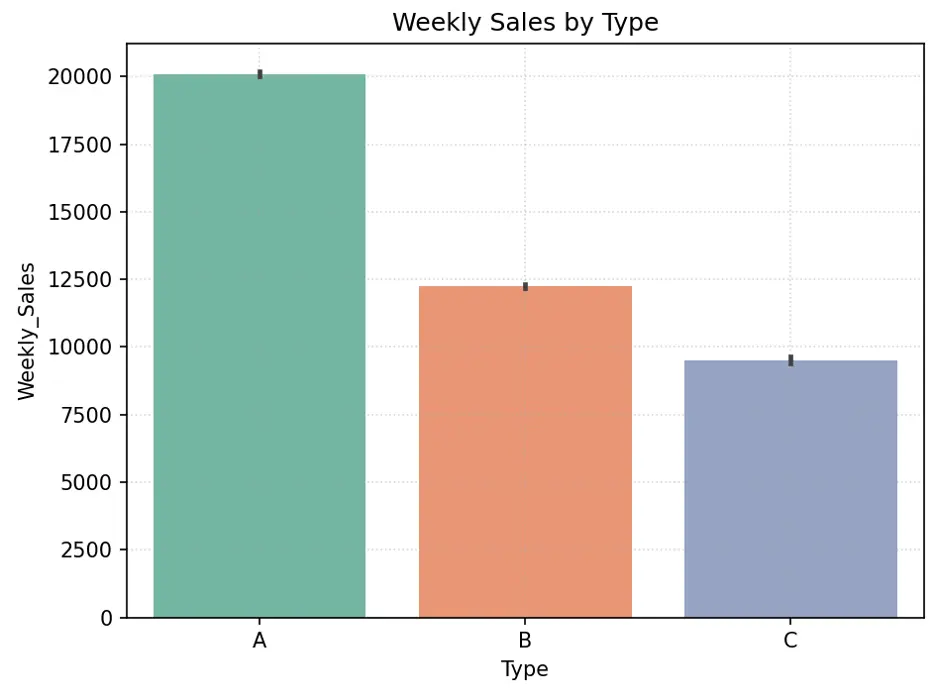
Directionally, larger stores should generate higher sales since they have more space for more items. Type A stores appear to have higher weekly sales than Type B stores, which appear to have higher weekly sales than Type C stores. There are more Type A stores, followed by Type B and Type C stores. Store size may be an important feature in predicting weekly sales.
Let’s create a scatter plot to visually break down weekly sales by store size and type:
# Create Scatter Plot Training Data by Store Type
plt.figure(figsize=(16,8))
fig = sns.scatterplot(data=train_val_df, x='Size', y='Weekly_Sales', hue='Type', palette="Set2")
plt.grid(True, linestyle=':', alpha=0.5)
plt.title('Size and Weekly Sales by Type')
plt.xlabel('Size')
plt.ylabel('Weekly_Sales')
plt.legend(loc='upper right')
plt.tight_layout()
plt.show()
Output:
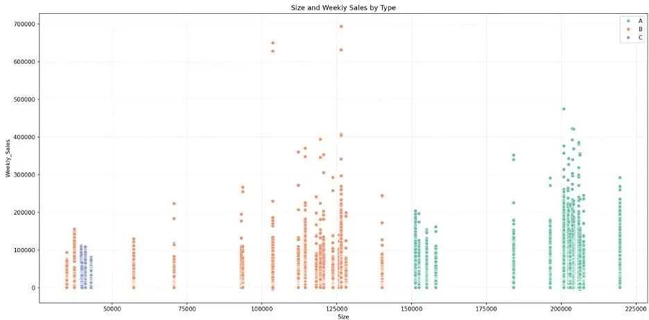
While the bar chart shows that larger stores generate higher weekly sales in the aggregate, the scatter plot shows that there is overlap in weekly sales across store types. We also note some weekly sales outliers.
Let’s create a box plot to visually check the relationship between weekly sales, store, and store type.
# Create Box Plot to Check Relationship Between Store, Weekly_Sales, and Type of Store
data = pd.concat([train_val_df['Store'], train_val_df['Weekly_Sales'], train_val_df['Type']], axis=1)
f, ax = plt.subplots(figsize=(23,7))
fig = sns.boxplot(x='Store', y='Weekly_Sales', data=data, showfliers=False, hue="Type", palette="Set2")
plt.grid(True, linestyle=':', alpha=0.5)
plt.title('Store and Weekly_Sales by Type')
plt.xlabel('Store')
plt.ylabel('Weekly_Sales')
plt.legend(loc='upper right')
plt.tight_layout()
plt.show()
Output:
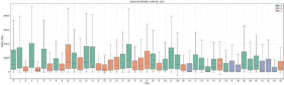
The plot shows that there is some symmetry between some stores within each store type, but there’s also quite a variance. For example, Type A (green) stores 2, 6, 13, 14, and 27 exhibit symmetry in their distributions of weekly sales, and Type A stores 28 and 31 also exhibit similar distributions.
Let’s create a bar chart showing the relationship between weekly sales by holidays and store type:
# Alternate to Box Plot - Create Bar Chart IsHoliday vs Weekly_Sales by Type
fig = sns.barplot(x='IsHoliday', y='Weekly_Sales', data=train_val_df, hue='Type', palette="Set2")
plt.grid(True, linestyle=':', alpha=0.5)
plt.title('Weekly Sales by IsHoliday and Type')
plt.tight_layout()
plt.show()
Output:
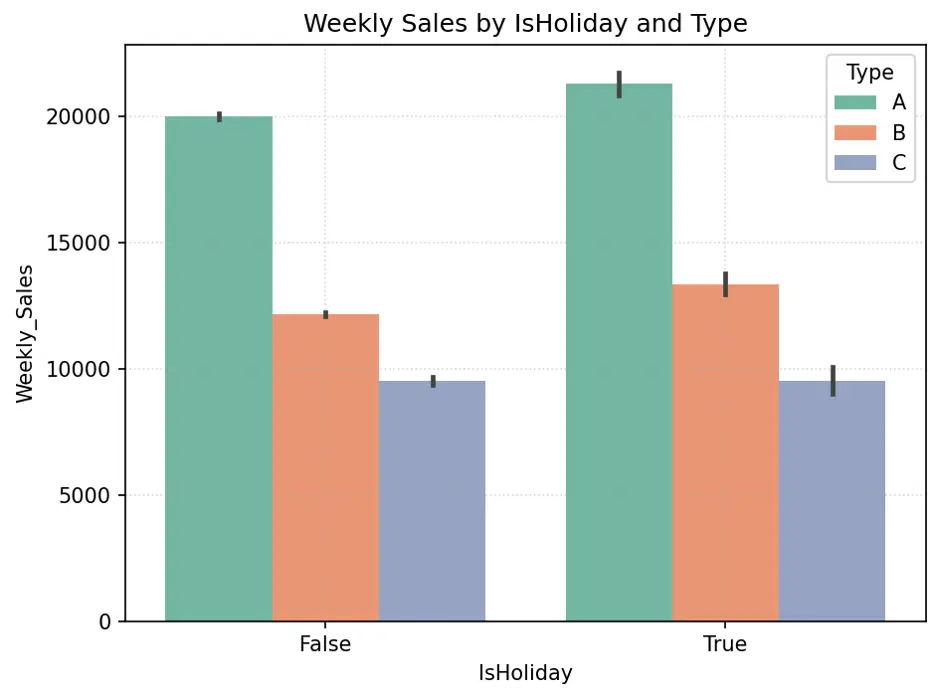
IsHoliday appears to generate higher weekly sales for Type A and B stores, but not necessarily Type C stores. Since roughly 90% of stores are either Type A or B, and there’s significant difference in weekly sales with holidays for these stores, the weeks with holidays may be an important feature in the models.
Let’s create pie chart to show the proportion of holidays:
# Create Pie Chart % of IsHoliday
plt.figure(figsize=(10,6))
plt.title("% of IsHoliday")
plt.pie(train_val_df.IsHoliday.value_counts(), labels=train_val_df.IsHoliday.value_counts().index, autopct='%1.1f%%', colors=sns.color_palette('Pastel1'))
plt.legend(loc='upper right')
plt.tight_layout()
plt.show()
Output:
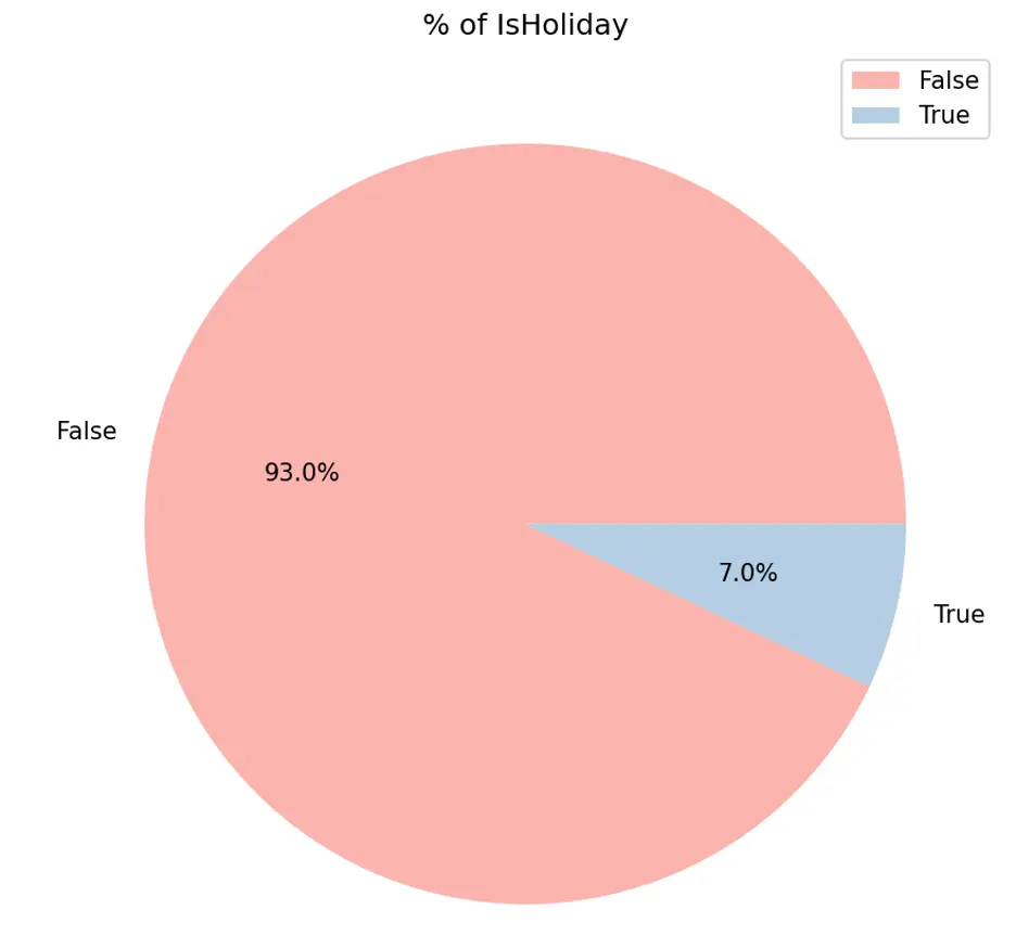
IsHolidays appear to generate higher weekly sales while only accounting for 7% of sales duration.
Let’s create a box plot showing the relationship between weekly sales for each store and holiday.
# Create Box Plot to Check Relationship Between Store, Weekly_Sales, and IsHoliday
data = pd.concat([train_val_df['Store'], train_val_df['Weekly_Sales'], train_val_df['IsHoliday']], axis=1)
f, ax = plt.subplots(figsize=(23,7))
fig = sns.boxplot(x='Store', y='Weekly_Sales', data=data, showfliers=False, hue="IsHoliday", palette="Set1")
plt.grid(True, linestyle=':', alpha=0.5)
plt.title('Store and Weekly_Sales by IsHoliday')
plt.xlabel('Store')
plt.ylabel('Weekly_Sales')
plt.legend(loc='upper right')
plt.tight_layout()
plt.show()
Output:
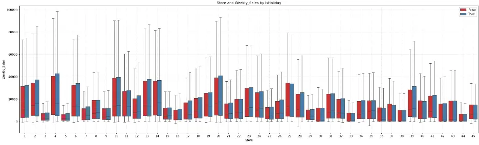
The box plot shows that for most stores, the weeks with holidays exhibit greater weekly sales. Certain groups of stores appear to have similar distributions, like the earlier box plot. For example, stores 6, 13, 14, and 27 have similar distributions, as do stores 28 and 31.
Let’s generate a box plot to visualize the relationship between weekly sales and department by type of store:
# Create Box Plot to Check Relationship Between Dept, Weekly_Sales, and IsHoliday
data = pd.concat([train_val_df['Dept'], train_val_df['Weekly_Sales'], train_val_df['IsHoliday']], axis=1)
f, ax = plt.subplots(figsize=(23,7))
fig = sns.boxplot(x='Dept', y='Weekly_Sales', data=data, showfliers=False, hue="IsHoliday", palette="Set1")
plt.grid(True, linestyle=':', alpha=0.5)
plt.title('Dept and Weekly_Sales by IsHoliday')
plt.xlabel('Dept')
plt.ylabel('Weekly_Sales')
plt.legend(loc='upper right')
plt.tight_layout()
plt.show()
Output:
Department 72 shows a significant increase in weekly sales during holidays. Outside of a few departments, there is symmetry in the distribution of data across several departments.
Let’s check the relationship between the mark downs (1-5) and weekly sales and store type by creating scatter plots:
# Create Scatter Plot MarkDown1 vs Weekly_Sales by Type
plt.figure(figsize=(16,8))
fig = sns.scatterplot(data=train_val_df, x='MarkDown1', y='Weekly_Sales', hue='Type', palette="Set2")
plt.grid()
plt.grid(True, linestyle=':', alpha=0.5)
plt.title('MarkDown1 and Weekly_Sales by Type')
plt.xlabel('MarkDown1')
plt.ylabel('Weekly_Sales')
plt.legend(loc='upper right')
plt.tight_layout()
plt.show()
Output:
There’s no obvious relationship here, to me.
MarkDown2:
# Create Scatter Plot MarkDown2 vs Weekly_Sales by Type
plt.figure(figsize=(16,8))
fig = sns.scatterplot(data=train_val_df, x='MarkDown2', y='Weekly_Sales', hue='Type', palette="Set2")
plt.grid()
plt.grid(True, linestyle=':', alpha=0.5)
plt.title('MarkDown2 and Weekly_Sales by Type')
plt.xlabel('MarkDown2')
plt.ylabel('Weekly_Sales')
plt.legend(loc='upper right')
plt.tight_layout()
plt.show()
Output:
MarkDown3:
# Create Scatter Plot MarkDown3 vs Weekly_Sales by Type
plt.figure(figsize=(16,8))
fig = sns.scatterplot(data=train_val_df, x='MarkDown3', y='Weekly_Sales', hue='Type', palette="Set2")
plt.grid()
plt.grid(True, linestyle=':', alpha=0.5)
plt.title('MarkDown3 and Weekly_Sales by Type')
plt.xlabel('MarkDown3')
plt.ylabel('Weekly_Sales')
plt.legend(loc='upper right')
plt.tight_layout()
plt.show()
Output:
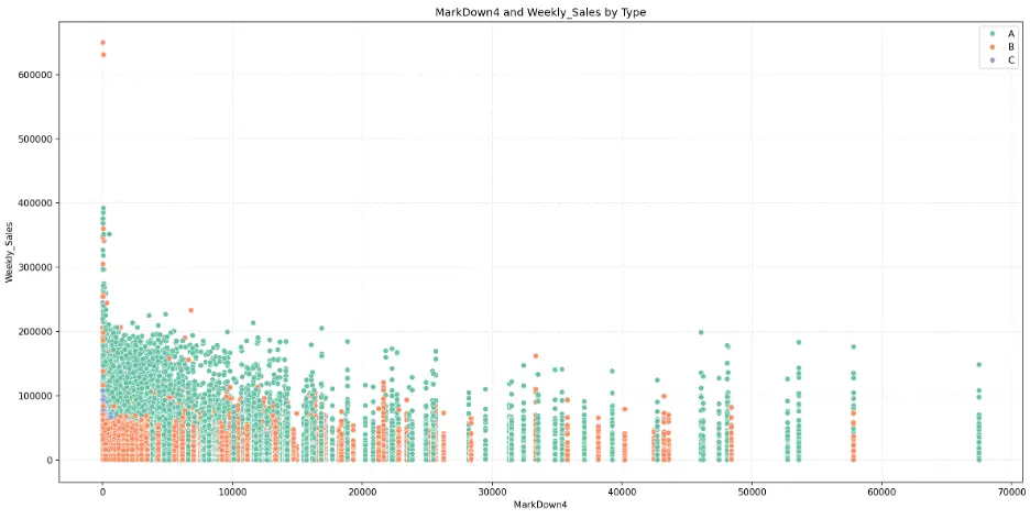
MarkDown4:
# Create Scatter Plot MarkDown4 vs Weekly_Sales by Type
plt.figure(figsize=(16,8))
fig = sns.scatterplot(data=train_val_df, x='MarkDown4', y='Weekly_Sales', hue='Type', palette="Set2")
plt.grid()
plt.grid(True, linestyle=':', alpha=0.5)
plt.title('MarkDown4 and Weekly_Sales by Type')
plt.xlabel('MarkDown4')
plt.ylabel('Weekly_Sales')
plt.legend(loc='upper right')
plt.tight_layout()
plt.show()
Output:
MarkDown5:
# Create Scatter Plot MarkDown5 vs Weekly_Sales by Type
plt.figure(figsize=(16,8))
fig = sns.scatterplot(data=train_val_df, x='MarkDown5', y='Weekly_Sales', hue='Type', palette="Set2")
plt.grid()
plt.grid(True, linestyle=':', alpha=0.5)
plt.title('MarkDown5 and Weekly_Sales by Type')
plt.xlabel('MarkDown5')
plt.ylabel('Weekly_Sales')
plt.legend(loc='upper right')
plt.tight_layout()
plt.show()
Output:
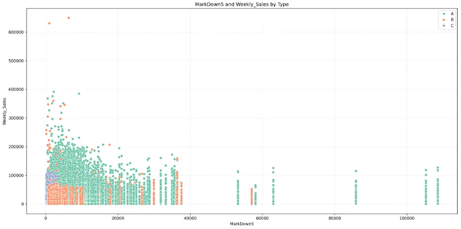
The mark downs may not be significant features for predicting weekly sales in the models.
As with box plots, histograms are a graphical representation for the frequency of numeric data values. Histograms are useful in determining the underlying probability of a dataset. In contrast, box plots less detailed than histograms, but are useful when comparing multiple datasets.
Let’s create a histogram to see how unemployment rates are distributed across different types of stores. We’ll add the Kernel Density Estimation curve which provides a smoothed estimate of the probability density for each group:
# Create Histogram Unemployment by Store Type
plt.figure(figsize=(14,6))
sns.histplot(data=train_val_df, x='Unemployment', bins=10, kde=True, hue='Type', palette="Set2")
plt.grid(True, linestyle=':', alpha=0.5)
plt.title('Unemployment by Type')
plt.tight_layout()
plt.show()
Output:
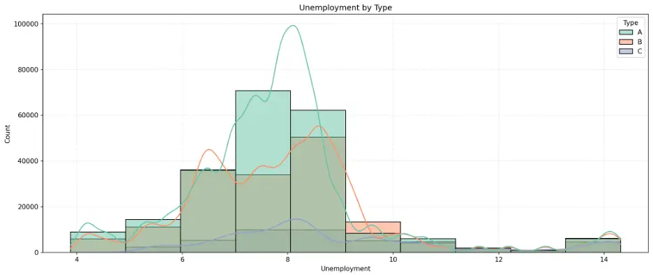
The peaks in the histogram bars and KDE curves identify the most common unemployment rates for each store type. This is a normal distribution, called a unimodal distribution due to the single peak, but with a slight skew toward higher unemployment rates.
Let’s do the same for CPI:
# Create Histogram CPI by Store Type
plt.figure(figsize=(14,6))
sns.histplot(data=train_val_df, x='CPI', bins=10, kde=True, hue='Type', palette="Set2")
plt.grid(True, linestyle=':', alpha=0.5)
plt.title('CPI by Type')
plt.tight_layout()
plt.show()
Output:
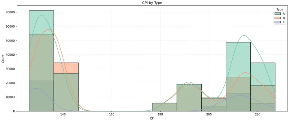
The histogram indicates an unusual, polarized distribution of CPI values. This is called a bimodal distribution due to the histogram having two distinct peaks at each end of the range where CPI data is clustered around the endpoints and having few observations in between relatively lower and higher values.
# Create Histogram Temperature by Store Type
plt.figure(figsize=(14,6))
sns.histplot(data=train_val_df, x='Temperature', bins=10, kde=True, hue='Type', palette="Set2")
plt.grid(True, linestyle=':', alpha=0.5)
plt.title('Temperature by Type')
plt.tight_layout()
plt.show()
Output:
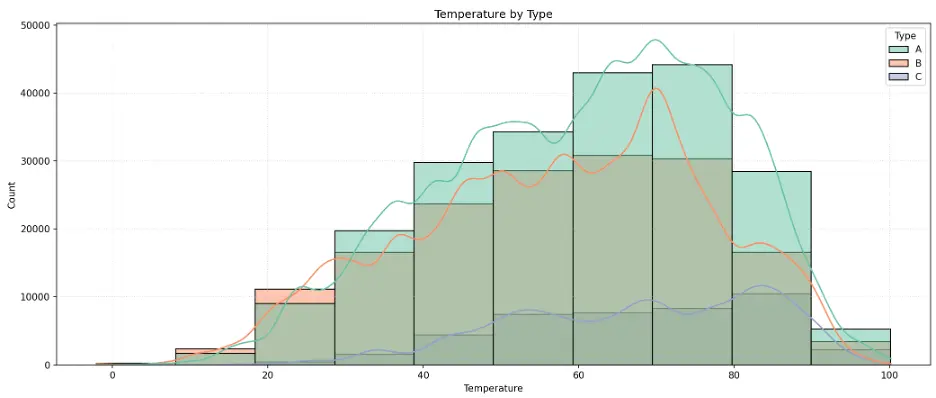
The histogram peaks around 70 for Type A and B stores, and closer to 90 for Type C stores.
I don’t expect unemployment, CPI, or temperature to be important features in the models.
Let’s create a correlation heatmap for numerical data in the training dataset, which can help to understand relationships the variables:
# Create Heatmap to Check Correlation
# Select Only Numerical Data
numerical_data_df=train_val_df.select_dtypes(include=['float64', 'int64', 'int32', 'UInt32'])
corr = numerical_data_df.corr()
plt.subplots(figsize=(16,12))
sns.heatmap(corr, cmap='summer', vmax=.5, center=0, annot=True, square=True, linewidths=0.5, cbar_kws={'shrink':.5})
sns.set(font_scale=0.8)
plt.show()
Output:
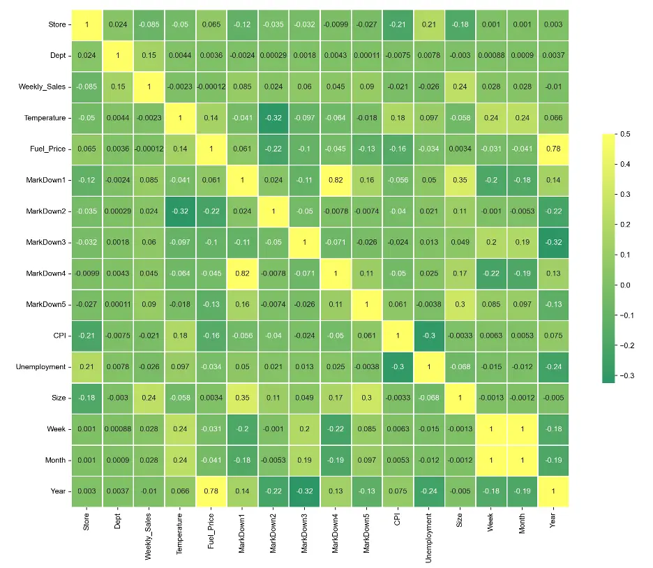
There are only a few areas of correlation. MarkDown 1 correlates relatively well with MarkDown 4, Month correlates with Week, and Year correlates with Fuel_Price.
3. Data Preprocessing
To prepare the dataset for modeling, let’s split the dataset into training, validation, and test datasets.
# Split the train_val_df DataFrame into Training, Validation, and Test datasets
print(train_val_df.Year.value_counts())
Output:

We’ll split the data based on time. We’ll use data prior to 2012 as training data and data from 2012 onward as the validation data. We’ll also define weekly sales as the target variable:
# Create Training, Validation, and Test splits
# For Time-Based Validation Split the Data into Training Data (Data Before 2012) and Validation Data (Data After 2012)
train_df = train_val_df[train_val_df.Year < 2012]
val_df = train_val_df[train_val_df.Year == 2012]
# Select 15 Input Features to Predict Weekly_Sales
input_cols = ['Store', 'Dept', 'IsHoliday', 'Temperature', 'Fuel_Price', 'CPI', 'MarkDown1', 'MarkDown2', 'MarkDown3', 'MarkDown4', 'MarkDown5', 'Unemployment', 'Type', 'Size', 'Week']
# Define Target Variable
target_col = 'Weekly_Sales'
# Prepare Training Data
train_inputs = train_df[input_cols].copy()
train_targets = train_df[target_col].copy()
# Prepare Validation Data
val_inputs = val_df[input_cols].copy()
val_targets = val_df[target_col].copy()
# Prepare Test Data
test_inputs = test_df[input_cols].copy()
# Print
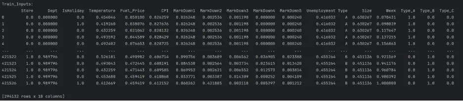
print("Train_Inputs: ")
print(train_inputs)
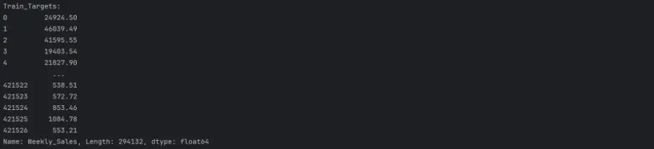
print("Train_Targets: ")
print(train_targets)
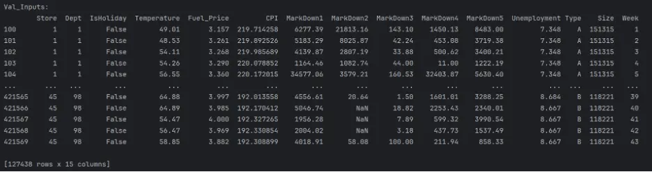
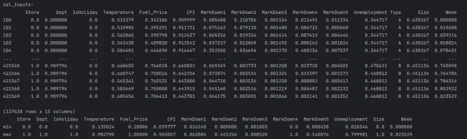
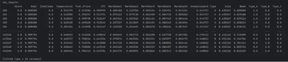
print("Val_Inputs: ")
print(val_inputs)
print("Val_Targets: ")
print(val_targets)
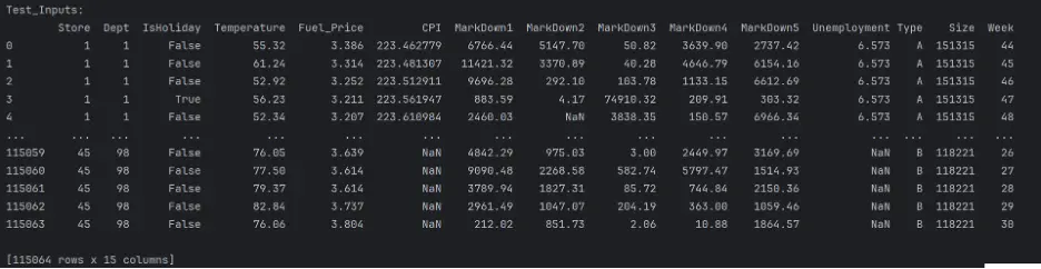
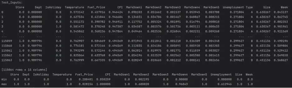
print("Test_Inputs: ")
print(test_inputs)
Output:
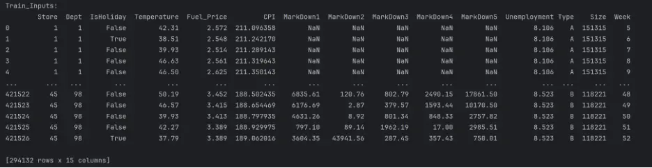
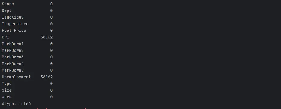
The datasets are mixed since they include both numerical and categorical values, and there are missing numerical values in a few columns. These need to be handled before building and training the models.
We’ll handle missing numerical values first. For the missing values in the ‘MarkDown’ columns, we will replace ‘NaN’ with zeroes which is effectively equivalent to no markdowns:
# Feature Classification
numeric_cols = ['Store', 'Dept', 'IsHoliday', 'Temperature', 'Fuel_Price', 'CPI', 'MarkDown1', 'MarkDown2', 'MarkDown3', 'MarkDown4', 'MarkDown5', 'Unemployment', 'Size', 'Week']
categorical_cols = ['Type']
# Fill NaN (Missing) Values in the MarkDown Columns with 0
train_inputs[['MarkDown1', 'MarkDown2', 'MarkDown3', 'MarkDown4', 'MarkDown5']] = train_inputs[['MarkDown1', 'MarkDown2', 'MarkDown3', 'MarkDown4', 'MarkDown5']].fillna(0)
val_inputs[['MarkDown1', 'MarkDown2', 'MarkDown3', 'MarkDown4', 'MarkDown5']] = val_inputs[['MarkDown1', 'MarkDown2', 'MarkDown3', 'MarkDown4', 'MarkDown5']].fillna(0)
test_inputs[['MarkDown1', 'MarkDown2', 'MarkDown3', 'MarkDown4', 'MarkDown5']] = test_inputs[['MarkDown1', 'MarkDown2', 'MarkDown3', 'MarkDown4', 'MarkDown5']].fillna(0)
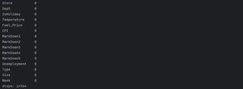
print(test_inputs.isna().sum())
Output:
Preprocessing Numerical Data
Let’s handle missing numerical values. We’ll use a simple imputation strategy to replace any missing values with a measure of central tendency for each variable, or feature.
# Impute Missing Values
imputer = SimpleImputer(strategy='mean').fit(test_inputs[numeric_cols])
test_inputs[numeric_cols] = imputer.transform(test_inputs[numeric_cols])
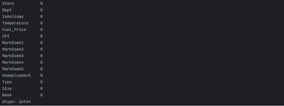
print(test_inputs.isna().sum())
Output:
print(train_inputs.isna().sum())
Output:
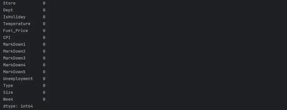
print(val_inputs.isna().sum())
Output:
Next, to improve the performance and convergence potential of the models, let’s ensure that all numeric features in the datasets are on a similar scale, from 0 to 1:
# Scaling Numeric Features
# Concatenate Training, Validation, and Test DataFrames into a single DataFrame
full_inputs_df = pd.concat([train_inputs, val_inputs, test_inputs])
# Use the MinMaxScaler on Numeric Features to Scale to a Fixed Range between 0 and 1
scaler = MinMaxScaler().fit(full_inputs_df[numeric_cols])
# Apply the Fitted Scaler to the Numeric Columns in Each Dataset Independently
train_inputs[numeric_cols] = scaler.transform(train_inputs[numeric_cols])
val_inputs[numeric_cols] = scaler.transform(val_inputs[numeric_cols])
test_inputs[numeric_cols] = scaler.transform(test_inputs[numeric_cols])
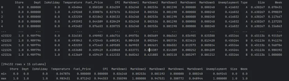
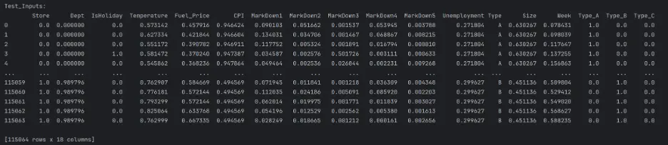
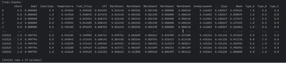
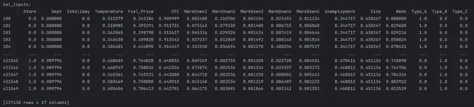
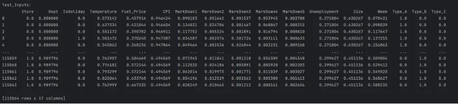
print("Train_Inputs: ")
print(train_inputs)
print(train_inputs.describe().loc[['min', 'max']])
print("Val_Inputs: ")
print(val_inputs)
print(val_inputs.describe().loc[['min', 'max']])
print("Test_Inputs: ")
print(test_inputs)
print(test_inputs.describe().loc[['min', 'max']])
Output:
Encoding Categorical Data
Let’s handle the categorical values now by using one-hot encoding, a technique used to represent categorical variables as numerical values. Setup and fit a OneHotEncoder for the categorical variables:
# Fit the Encoder on the Categorical Columns of the Full DataFrame
encoder = OneHotEncoder(sparse_output=False).fit(full_inputs_df[categorical_cols])
# Retrieve the Names of the New Columns After One-Hot Encoding and Convert to a List
encoded_cols = list(encoder.get_feature_names_out(categorical_cols))
print(encoded_cols)
Output:

Values between 0 and 1 are transformed in each column by a MinMax Scaler. Since One-hot and IsHoliday are already in the range of 0 and 1, they won't be influenced using encoded columns.
Now that the encoder is prepared, let’s perform one-hot encoding on categorical columns in the three different datasets, train_inputs, val_inputs, and test_inputs:
train_inputs[encoded_cols] = encoder.transform(train_inputs[categorical_cols])
val_inputs[encoded_cols] = encoder.transform(val_inputs[categorical_cols])
test_inputs[encoded_cols] = encoder.transform(test_inputs[categorical_cols])
print("Train_Inputs: ")
print(train_inputs)
print("Val_Inputs: ")
print(val_inputs)
print("Test_Inputs: ")
print(test_inputs)
Output:
Since we now have encoded numerical columns, we can remove the categorical columns:
# Select Only Numeric and Encoded Columns to Keep in Each Dataset and Update the Existing Datasets to Include Only Specified Columns
train_inputs = train_inputs[numeric_cols + encoded_cols]
val_inputs = val_inputs[numeric_cols + encoded_cols]
test_inputs = test_inputs[numeric_cols + encoded_cols]
print("Train_Inputs: ")
print(train_inputs)
print("Val_Inputs: ")
print(val_inputs)
print("Test_Inputs: ")
print(test_inputs)
Output:
4. Model Building
We’re ready to start training ML models! We have finished preprocessing the datasets! Baseline Model
A baseline model is a simple model that can serve as a benchmark to compare other, more complex models against.
We’ll train a linear regression model as our baseline model. Linear regression algorithms try to express the target as a weighted sum of the inputs.
# Train and Evaluate a Baseline Linear Regression Model
from sklearn.linear_model import LinearRegression
linreg_model = LinearRegression()
linreg_model.fit(train_inputs, train_targets)
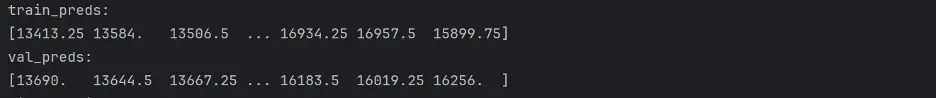
train_preds = linreg_model.predict(train_inputs)
val_preds = linreg_model.predict(val_inputs)
print("Train_Preds: ")
print(train_preds)
print("Val_Preds: ")
print(val_preds)
Output:
We need to calculate WMAE for each model. MAE is the average difference between predicted values and actual values, and in this project, we will weight the weeks with holidays 5x more than weeks without holidays.
In addition to WMAE, we’ll also calculate the accuracy of each model using MSE, RMSE, and R-squared, which are commonly used for regression problems:
- Mean Squared Error (MSE) – is the average squared difference between the predicted values and observed values. It is always a positive number, and values close to zero are better.
- Root Mean Squared Error (RMSE) – indicates how far apart the predicted values are from the observed values, on average.
- R-squared (R²) score – is the coefficient of determination, and ranges from 0 to 1. It represents how observed results are reproduced by the model. 0 indicates that the predicted variables cannot be explained at all by the predictor variables. 1 indicates that the predicted variable can be perfectly explained by the predictor variables.
# Calculate Accuracy of the Baseline Linear Regression Model
def calculate_regression_metrics(y_true, y_pred, inputs):
    weights = inputs.IsHoliday.apply(lambda x: 5 if x else 1)
    mse = mean_squared_error(y_true, y_pred)
    rmse = np.sqrt(mse)
    wmae = weighted_mean_absolute_error(y_true, y_pred, weights)
    r2 = r2_score(y_true, y_pred)

    return {
        'MSE': mse,
        'RMSE': rmse,
        'WMAE': wmae,
        'R2': r2
    }

def weighted_mean_absolute_error(y_true, y_pred, weights):
    return np.sum(np.multiply(abs(y_true - y_pred), weights)) / np.sum(weights)

# Calculate metrics for training data
train_metrics = calculate_regression_metrics(train_targets, train_preds, train_inputs)

# Calculate metrics for validation data
val_metrics = calculate_regression_metrics(val_targets, val_preds, val_inputs)

# Print the results
print("Training Metrics:")
for metric, value in train_metrics.items():
    print(f"{metric}: {value:.4f}")

print("\nValidation Metrics:")
for metric, value in val_metrics.items():
    print(f"{metric}: {value:.4f}")
Output:
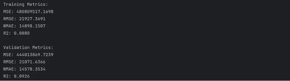
The values WMAE in the baseline model are quite large. MSE and RMSE are also quite large, and R-squared is quite low.
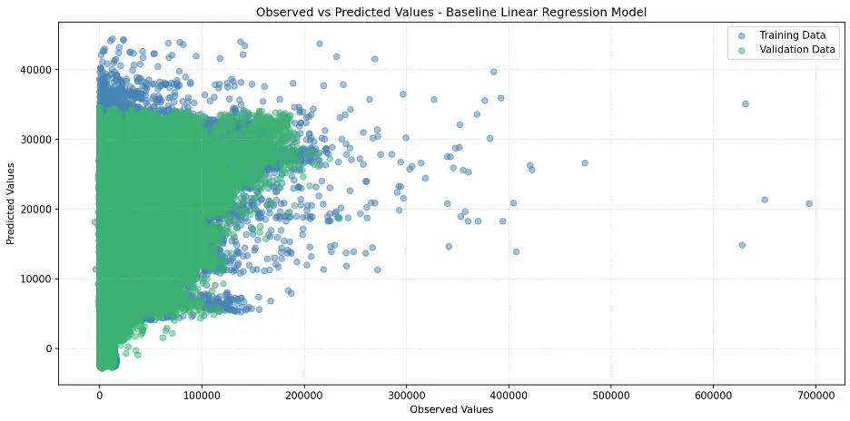
Let’s create a scatter plot to visualize the relationship between observed and predicted values:
# Create Scatter Plot Between Observed and Predicted Values
plt.figure(figsize=(12,6))
plt.scatter(train_targets, train_preds, color='steelblue', alpha=0.5, label='Training Data')
plt.scatter(val_targets, val_preds, color='mediumseagreen', alpha=0.5, label='Validation Data')
plt.xlabel('Observed Values')
plt.ylabel('Predicted Values')
plt.title('Observed vs Predicted Values - Baseline Linear Regression Model')
plt.legend()
plt.grid(True, linestyle=':', alpha=0.5)
plt.tight_layout()
plt.show()
Output:
Train and Evaluate Different Models
Let’s dive further into the world of machine learning models! We’re about to unleash powerful algorithms to tackle our sales prediction challenge. Here are the contenders:
- Ridge Regression: The smooth operator. Imagine linear regression with a twist. This algorithm adds a special penalty to keep our model in check, making sure we don't go overboard with less important variables. It's like having a savvy financial advisor for your data!
- Decision Tree: The choose-your-own-adventure of ML. Picture a flowchart that comes to life. Starting from the root node (our main decision point), we'll branch out into a maze of choices. Each fork in the road brings us closer to our prediction, creating a fascinating tree of possibilities. It's data storytelling at its finest!
- Random Forest: The wisdom of the crowd. Why settle for one tree when you can have a whole forest? This ensemble method creates a bustling community of decision trees, each with its own unique perspective. For classification, they vote on the outcome. For regression, they put their heads together to give us an average prediction. It's democracy in action!
- Gradient Boosting: The tag team champion. Last but not least, we have the powerhouse of the ML world. Gradient Boosting is like a relay race of algorithms, each one learning from the mistakes of the last. These "weak learners" team up to form an unstoppable prediction machine. It's the ultimate example of "stronger together.”
Each of these models brings something special to the table. We'll be putting them through their paces, seeing how they handle our Walmart sales data. Get ready for some friendly competition as we uncover which algorithm reigns supreme in our forecasting challenge!
Let's start crunching some numbers!
Ridge Regression Model
Let’s build the Ridge Regression model:
# Train Ridge Regression Model
from sklearn.linear_model import Ridge
linreg_model1 = Ridge(random_state=42)
linreg_model1.fit(train_inputs, train_targets)
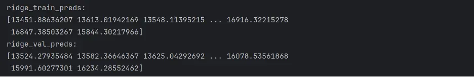
ridge_train_preds=linreg_model1.predict(train_inputs)
ridge_val_preds = linreg_model1.predict(val_inputs)
print("ridge_Train_preds: ")
print(ridge_train_preds)
print("ridge_val_preds: ")
print(ridge_val_preds)
Output:
Let’s calculate the accuracy of the Ridge Model:
# Calculate Accuracy of the Ridge Model
def calculate_regression_metrics(y_true, y_pred, inputs):
    weights = inputs.IsHoliday.apply(lambda x: 5 if x else 1)

    mse = mean_squared_error(y_true, y_pred)
    rmse = np.sqrt(mse)
    wmae = weighted_mean_absolute_error(y_true, y_pred, weights)
    r2 = r2_score(y_true, y_pred)

    return {
        'MSE': mse,
        'RMSE': rmse,
        'WMAE': wmae,
        'R2': r2
    }

def weighted_mean_absolute_error(y_true, y_pred, weights):
    return np.sum(np.multiply(abs(y_true - y_pred), weights)) / np.sum(weights)

# Calculate metrics for training data
train_metrics = calculate_regression_metrics(train_targets, ridge_train_preds, train_inputs)

# Calculate metrics for validation data
val_metrics = calculate_regression_metrics(val_targets, ridge_val_preds, val_inputs)

# Print the results
print("Training Metrics:")
for metric, value in train_metrics.items():
    print(f"{metric}: {value:.4f}")

print("\nValidation Metrics:")
for metric, value in val_metrics.items():
    print(f"{metric}: {value:.4f}")
Output:
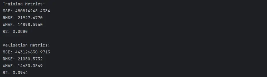
The Ridge model does not appear to perform any better than the baseline linear regression model.
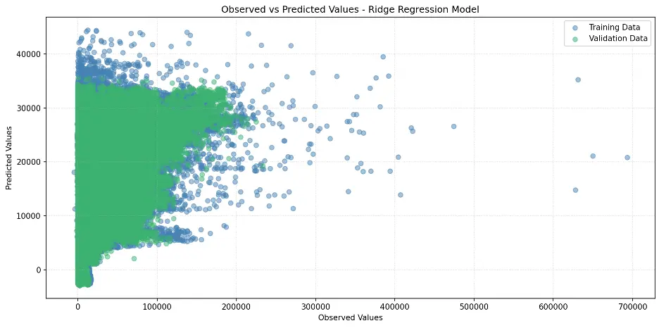
Let’s create a scatter plot of observed and predicted values:
# Create Scatter Plot Between Observed and Predicted Values
plt.figure(figsize=(12,6))
plt.scatter(train_targets, ridge_train_preds, color='steelblue', alpha=0.5, label='Training Data')
plt.scatter(val_targets, ridge_val_preds, color='mediumseagreen', alpha=0.5, label='Validation Data')
plt.xlabel('Observed Values')
plt.ylabel('Predicted Values')
plt.title('Observed vs Predicted Values - Ridge Regression Model')
plt.legend()
plt.grid(True, linestyle=':', alpha=0.5)
plt.tight_layout()
plt.show()
Output:
Decision Tree Model
Let’s build the decision tree model and calculate its accuracy:
# Train Decision Tree Model
from sklearn.tree import DecisionTreeRegressor
tree = DecisionTreeRegressor(random_state = 42)
# Fit the Model to the Training Data
tree.fit(train_inputs, train_targets)

# Generate Predictions on the Training and Validation Datasets Using the Trained Decision Tree
#from sklearn.metrics import mean_squared_error
tree_train_preds = tree.predict(train_inputs)
tree_train_rmse = root_mean_squared_error(train_targets, tree_train_preds)
tree_val_preds = tree.predict(val_inputs)

# Calculate Accuracy of the Decision Tree Model
def calculate_regression_metrics(y_true, y_pred, inputs):
    weights = inputs.IsHoliday.apply(lambda x: 5 if x else 1)

    mse = mean_squared_error(y_true, y_pred)
    rmse = np.sqrt(mse)
    wmae = weighted_mean_absolute_error(y_true, y_pred, weights)
    r2 = r2_score(y_true, y_pred)

    return {
        'MSE': mse,
        'RMSE': rmse,
        'WMAE': wmae,
        'R2': r2
    }

def weighted_mean_absolute_error(y_true, y_pred, weights):
    return np.sum(np.multiply(abs(y_true - y_pred), weights)) / np.sum(weights)

# Calculate metrics for training data
train_metrics = calculate_regression_metrics(train_targets, tree_train_preds, train_inputs)

# Calculate metrics for validation data
val_metrics = calculate_regression_metrics(val_targets, tree_val_preds, val_inputs)

# Print the results
print("Training Metrics:")
for metric, value in train_metrics.items():
    print(f"{metric}: {value:.4f}")

print("\nValidation Metrics:")
for metric, value in val_metrics.items():
    print(f"{metric}: {value:.4f}")
Output:
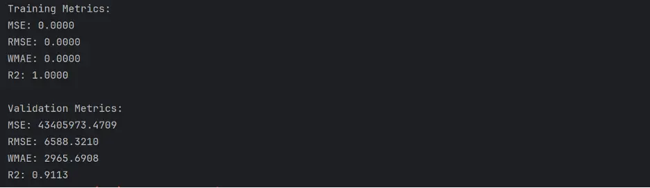
The performance of the decision tree is better than the Ridge model.
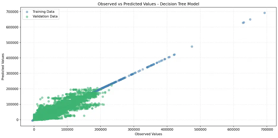
Let’s create a scatter plot for the decision tree model:
# Create Scatter Plot Between Observed and Predicted Values
plt.figure(figsize=(12,6))
plt.scatter(train_targets, tree_train_preds, color='steelblue', alpha=0.5, label='Training Data')
plt.scatter(val_targets, tree_val_preds, color='mediumseagreen', alpha=0.5, label='Validation Data')
plt.xlabel('Observed Values')
plt.ylabel('Predicted Values')
plt.title('Observed vs Predicted Values - Decision Tree Model')
plt.legend()
plt.grid(True, linestyle=':', alpha=0.5)
#plt.axis('equal')
plt.tight_layout()
plt.show()
Output:
Let’s determine the number of levels and the number of leaf nodes in the decision tree model:
# Determine the Number of Levels in the Decision Tree
def get_tree_depth(tree):
    return tree.get_depth()

tree_depth = get_tree_depth(tree)
print(f"Depth of the tree: {tree_depth}")

# Count the Number of Leaf Nodes
def count_leaf_nodes(tree):
    return tree.tree_.n_leaves

leaf_count = count_leaf_nodes(tree)
print(f"Number of leaf nodes: {leaf_count}")
Output:

Since we did not explicitly set the max_depth and max_leaf_nodes parameters of the decision tree, we allowed the tree to grow to its full depth, which includes 47 levels and 292865 leaf nodes.
Not constraining max_depth or max_leaf_nodes can either help the tree capture complex patterns in the training data, or it can lead to the model fitting the training data to such an extent that it fails to make accurate predictions outside of the training data, which is called overfitting.
Let’s build a graphic visualization of the decision tree but limit the number of levels to three:
# Visualize the Decision Tree Model
from sklearn.tree import plot_tree, export_text
sns.set_style('darkgrid')
plt.figure(figsize=(20,10))
plot_tree(tree, feature_names=train_inputs.columns, max_depth=3, filled=True);
plt.tight_layout()
plt.show()
Output:

Next, let’s evaluate which columns, or features, are the most important for the decision tree model. To do this, we’ll review the weights that the model assigned to each feature:
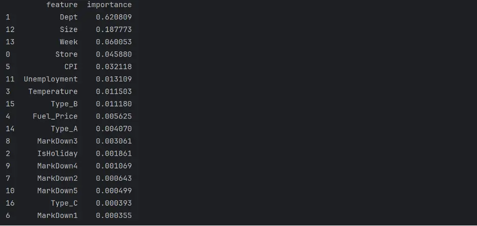
# Review Decision Tree Model Feature Importance
tree_importances = tree.feature_importances_
tree_importance_df = pd.DataFrame({'feature': train_inputs.columns, 'importance': tree_importances}).sort_values('importance', ascending=False)
print(tree_importance_df)
Output:
Let’s visualize feature importance in the model using a bar chart:
# Create Bar Chart of Weights
fig = sns.barplot(x='importance', y='feature', data=tree_importance_df.head(10), hue='feature', palette="Set2", legend=False)
plt.grid(True, linestyle=':', alpha=0.5)
plt.title('Decision Tree Feature Importance')
plt.tight_layout()
plt.show()
Output:
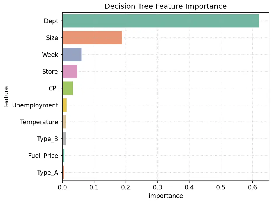
In this model, the most important feature is Dept, followed by Size, Week, and Store.
Random Forest Model
Let’s build and train a random forest model and calculate its accuracy:
rf1 = RandomForestRegressor(random_state=42, n_estimators=10)
# Fit the Model to the Training Data
rf1.fit(train_inputs, train_targets)

# Generate Predictions on the Training and Validation Datasets
rf1_train_preds = rf1.predict(train_inputs)
rf1_val_preds = rf1.predict(val_inputs)

# Calculate Accuracy of the Random Forest Model
def calculate_regression_metrics(y_true, y_pred, inputs):
    weights = inputs.IsHoliday.apply(lambda x: 5 if x else 1)

    mse = mean_squared_error(y_true, y_pred)
    rmse = np.sqrt(mse)
    wmae = weighted_mean_absolute_error(y_true, y_pred, weights)
    r2 = r2_score(y_true, y_pred)

    return {
        'MSE': mse,
        'RMSE': rmse,
        'WMAE': wmae,
        'R2': r2
    }

def weighted_mean_absolute_error(y_true, y_pred, weights):
    return np.sum(np.multiply(abs(y_true - y_pred), weights)) / np.sum(weights)

# Calculate metrics for training data
train_metrics = calculate_regression_metrics(train_targets, rf1_train_preds, train_inputs)

# Calculate metrics for validation data
val_metrics = calculate_regression_metrics(val_targets, rf1_val_preds, val_inputs)

# Print the results
print("Training Metrics:")
for metric, value in train_metrics.items():
    print(f"{metric}: {value:.4f}")

print("\nValidation Metrics:")
for metric, value in val_metrics.items():
    print(f"{metric}: {value:.4f}")
Output:
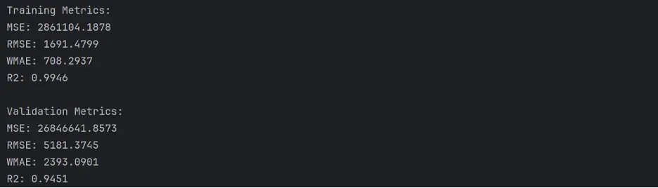
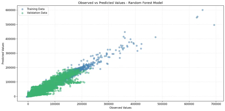
This model appears to perform better than our prior models.
Let’s create the scatter plot:
# Create Scatter Plot Between Observed and Predicted Values
plt.figure(figsize=(12,6))
plt.scatter(train_targets, rf1_train_preds, color='steelblue', alpha=0.5, label='Training Data')
plt.scatter(val_targets, rf1_val_preds, color='mediumseagreen', alpha=0.5, label='Validation Data')
plt.xlabel('Observed Values')
plt.ylabel('Predicted Values')
plt.title('Observed vs Predicted Values – Random Forest Model')
plt.legend()
plt.grid(True, linestyle=':', alpha=0.5)
plt.tight_layout()
plt.show()
Output:
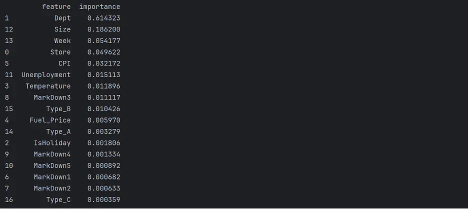
Let’s review feature importance in the random forest model:
# Review Random Forest Model Feature Importance
rf1_importance_df = pd.DataFrame({'feature': train_inputs.columns, 'importance': rf1.feature_importances_}).sort_values('importance', ascending=False)
print(rf1_importance_df)
Output:
Let’s visualize feature importance with a bar chart:
# Create Bar Chart of Weights
fig = sns.barplot(x='importance', y='feature', data=rf1_importance_df.head(10), hue='feature', palette="Set2", legend=False)
plt.grid(True, linestyle=':', alpha=0.5)
plt.title('Random Forest Feature Importance')
plt.tight_layout()
plt.show()
Output:
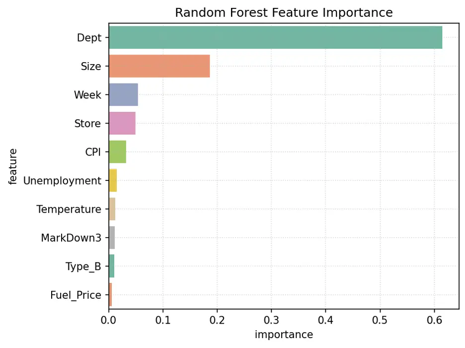
The variables Dept, Size, Week, and Store are the most important features in this model.
Gradient Boosting Model
Let’s train a gradient boosting model and calculate its accuracy:
# Train Gradient Boosting Model
from xgboost import XGBRegressor
gb1 = XGBRegressor(random_state=42, n_jobs=-1, n_estimators=20, max_depth=4)

# Train the model using gb1.fit.
gb1.fit(train_inputs, train_targets)

# Make Predictions and Evaluate the Model Using gb1.predict
gb1_train_preds = gb1.predict(train_inputs)
gb1_val_preds = gb1.predict(val_inputs)


# Calculate Accuracy of the Gradient Boost Model
def calculate_regression_metrics(y_true, y_pred, inputs):
    weights = inputs.IsHoliday.apply(lambda x: 5 if x else 1)

    mse = mean_squared_error(y_true, y_pred)
    rmse = np.sqrt(mse)
    wmae = weighted_mean_absolute_error(y_true, y_pred, weights)
    r2 = r2_score(y_true, y_pred)

    return {
        'MSE': mse,
        'RMSE': rmse,
        'WMAE': wmae,
        'R2': r2
    }

def weighted_mean_absolute_error(y_true, y_pred, weights):
    return np.sum(np.multiply(abs(y_true - y_pred), weights)) / np.sum(weights)

# Calculate metrics for training data
train_metrics = calculate_regression_metrics(train_targets, gb1_train_preds, train_inputs)

# Calculate metrics for validation data
val_metrics = calculate_regression_metrics(val_targets, gb1_val_preds, val_inputs)

# Print the results
print("Training Metrics:")
for metric, value in train_metrics.items():
    print(f"{metric}: {value:.4f}")

print("\nValidation Metrics:")
for metric, value in val_metrics.items():
    print(f"{metric}: {value:.4f}")
Output:
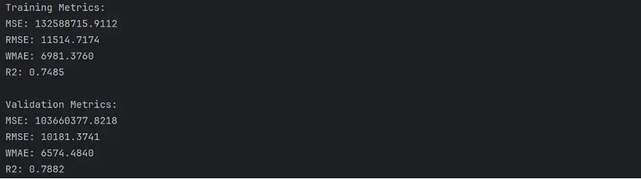
The gradient boost model does not perform as well as the decision tree or random forest models.
Let’s generate the scatter plot for the model:
# Create Scatter Plot Between Observed and Predicted Values
plt.figure(figsize=(12,6))
plt.scatter(train_targets, gb1_train_preds, color='steelblue', alpha=0.5, label='Training Data')
plt.scatter(val_targets, gb1_val_preds, color='mediumseagreen', alpha=0.5, label='Validation Data')
plt.xlabel('Observed Values')
plt.ylabel('Predicted Values')
plt.title('Observed vs Predicted Values - Gradient Boost Model')
plt.legend()
plt.grid(True, linestyle=':', alpha=0.5)
plt.tight_layout()
plt.show()
Output:
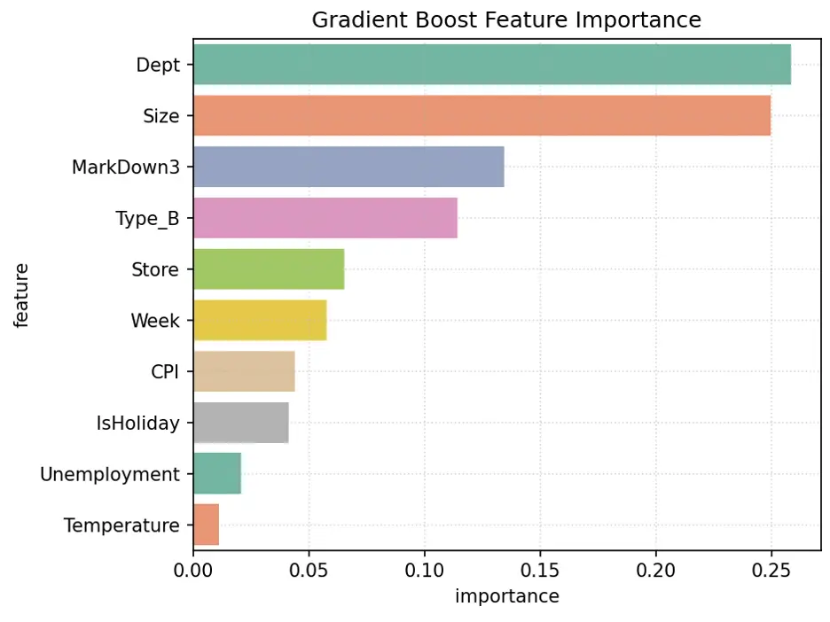
XGBoost provides a feature importance score for each column, or feature, of the input, like decision trees and random forests:
# Review Gradient Boost Model Feature Importance
gb1_importance_df = pd.DataFrame({'feature': train_inputs.columns, 'importance': gb1.feature_importances_}).sort_values('importance', ascending=False)
print(gb1_importance_df.head(10))
Output:
Let’s visualize the weights assigned to each feature:
# Create Bar Chart of Weights
fig = sns.barplot(x='importance', y='feature', data=gb1_importance_df.head(10), hue='feature', palette="Set2", legend=False)
plt.grid(True, linestyle=':', alpha=0.5)
plt.title('Gradient Boost Feature Importance')
plt.tight_layout()
plt.show()
Output:
Hyperparameter Tuning
Imagine parameters as the building blocks of the model's brain. As the model learns, it tweaks these blocks to create the perfect map from input to output. Now, hyperparameters are like the secret sauce in the model's recipe. They guide the learning process, but once the dish is done, they vanish - leaving only the perfectly seasoned parameters behind.
As ML chefs, we get to play with this secret sauce before cooking begins. Our mission? To find the perfect blend that makes our model's predictions as spot-on as possible. It's like a culinary experiment - we keep tweaking the recipe, tasting the results, until we discover that mouthwatering combination of hyperparameters that makes our model shine.
Decision Tree Regressor Model
Let’s dive into the world of decision trees. We’ll build a regressor that learns from its mistakes!
Picture this: we're about to embark on a treasure hunt, searching for the perfect parameters to make our model shine. Our map? A series of charts that'll guide us through the jungle of hyperparameters.
We'll set up two companions for our journey: they are pytest fixtures named 'param_name' and 'param_values'. Think of them as our compass and binoculars, helping us navigate the terrain of possibilities.
Our quest will take us through the lands of two decision tree parameters, 'max_depth' and 'max_leaf_nodes'. We'll be on the lookout for two troublemakers: overfitting and underfitting. If we spot the training and validation error lines drifting apart like old friends, we've stumbled into overfitting territory. On the flip side, if both lines stick together like glue at high values, we might be in the underfitting zone.
The ultimate prize? The sweet spot where our validation error hits rock bottom. That's where our model finds the perfect balance - not too simple, not too complex, but just right.
Let’s chart these waters and discover the hidden treasures of optimal parameters:
def test_param(**params):
    model = DecisionTreeRegressor(random_state=42, **params).fit(train_inputs, train_targets)
    weights_train = train_inputs.IsHoliday.apply(lambda x: 5 if x else 1)
    weights_val = val_inputs.IsHoliday.apply(lambda x: 5 if x else 1)
    train_wmae = np.sum(np.multiply(abs(train_targets - model.predict(train_inputs)), weights_train)) / (np.sum(weights_train))
    val_wmae = np.sum(np.multiply(abs(val_targets - model.predict(val_inputs)), weights_val)) / (np.sum(weights_val))
    return train_wmae, val_wmae

import pytest

@pytest.fixture(params=["max_depth", "max_leaf_nodes"])
def param_name(request):
    return request.param

@pytest.fixture
def param_values(param_name):
    if param_name == "max_depth":
        return [10, 40, 80, 120]
    elif param_name == "max_leaf_nodes":
        return [500, 1000, 2000, 3000, 4000]

def test_param_and_plot1(param_name, param_values):
    train_errors, val_errors = [], []

    # Computing and Appending Errors
    for value in param_values:
        param = {param_name: value}
        train_wmae, val_wmae = test_param(**param)
        train_errors.append(train_wmae)
        val_errors.append(val_wmae)

    # Printing Errors for Each Parameter Value
    print()
    print("Param_values:", param_values)
    print("Training_errors:", train_errors)
    print("Validation_errors:", val_errors)

    # Plotting the Overfitting Curve for the Parameter
    plt.figure(figsize=(10,6))
    plt.grid()
    plt.title('Overfitting Curve: ' + param_name)
    plt.plot(param_values, train_errors, 'b-o')
    plt.plot(param_values, val_errors, 'r-o')
    plt.xlabel(param_name)
    plt.ylabel('Weighted Mean Absolute Error (WMAE)')
    plt.legend(['Training', 'Validation'])
    plt.tight_layout()
    plt.show()
Output:
max_depth:

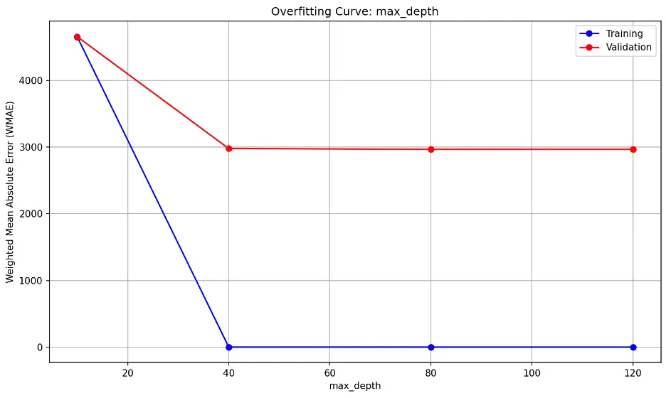
The trend shows errors decreasing significantly beyond max_depth of 10, indicating that 10 may be insufficient for the data. The flat lines after max_depth of 10 however suggests that the model’s performance on unseen data (validation) does not significantly improve the model’s performance on the validation dataset.
max_leaf_nodes:

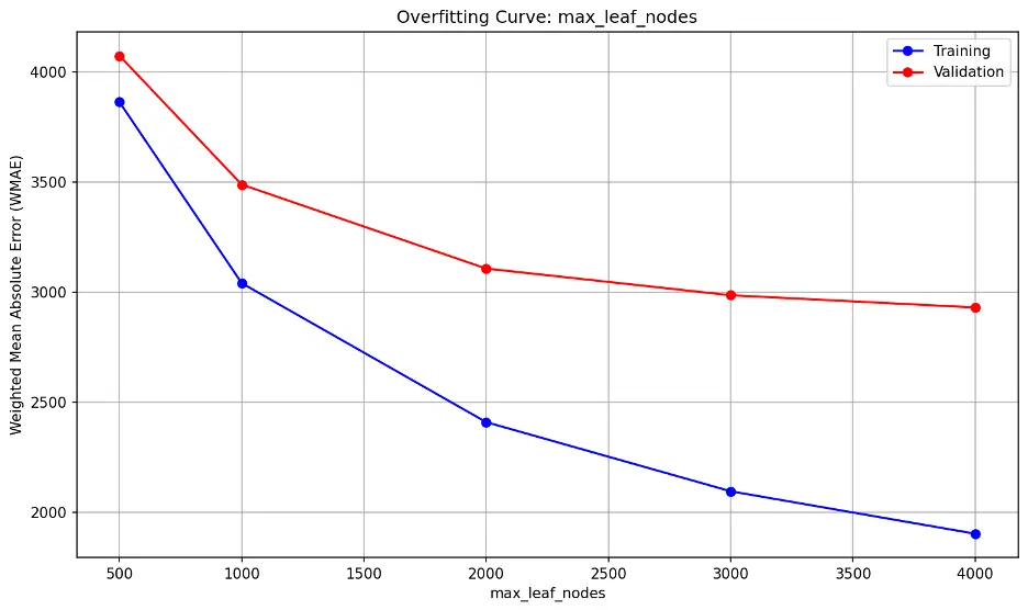
The error lines do not significantly diverge, nor are they close together. The lowest point on the validation error line is 4000 but it’s still slightly declining.
Decision Tree with Custom Parameters
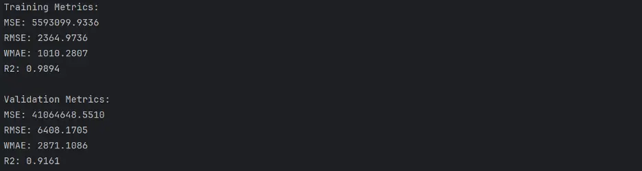
Based on the decision tree regressor model results, we’ll set max_depth to 18 and no specified max_leaf_nodes:
# Training a Custom Decision Tree Model
tree2 = DecisionTreeRegressor(max_depth=18, random_state=42)
# Train the Model
tree2.fit(train_inputs, train_targets)
# Generate Predictions for the Final Model
tree2_train_preds = tree2.predict(train_inputs)
tree2_val_preds = tree2.predict(val_inputs)
Calculate the accuracy of the model:
def calculate_regression_metrics(y_true, y_pred, inputs):
    weights = inputs.IsHoliday.apply(lambda x: 5 if x else 1)

    mse = mean_squared_error(y_true, y_pred)
    rmse = np.sqrt(mse)
    wmae = weighted_mean_absolute_error(y_true, y_pred, weights)
    r2 = r2_score(y_true, y_pred)

    return {
        'MSE': mse,
        'RMSE': rmse,
        'WMAE': wmae,
        'R2': r2
    }

def weighted_mean_absolute_error(y_true, y_pred, weights):
    return np.sum(np.multiply(abs(y_true - y_pred), weights)) / np.sum(weights)

# Calculate metrics for training data
train_metrics = calculate_regression_metrics(train_targets, tree2_train_preds, train_inputs)

# Calculate metrics for validation data
val_metrics = calculate_regression_metrics(val_targets, tree2_val_preds, val_inputs)

# Print the results
print("Training Metrics:")
for metric, value in train_metrics.items():
    print(f"{metric}: {value:.4f}")

print("\nValidation Metrics:")
for metric, value in val_metrics.items():
    print(f"{metric}: {value:.4f}")
Output:
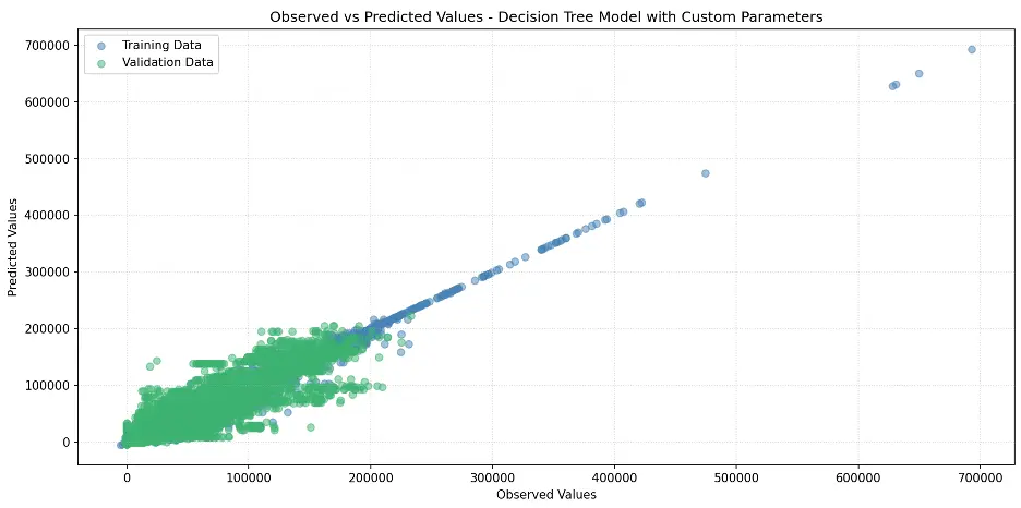
Let’s plot the model:
# Create Scatter Plot Between Observed and Predicted Values
plt.figure(figsize=(12,6))
plt.scatter(train_targets, tree2_train_preds, color='steelblue', alpha=0.5, label='Training Data')
plt.scatter(val_targets, tree2_val_preds, color='mediumseagreen', alpha=0.5, label='Validation Data')
plt.xlabel('Observed Values')
plt.ylabel('Predicted Values')
plt.title('Observed vs Predicted Values - Decision Tree Model with Custom Parameters')
plt.legend()
plt.grid(True, linestyle=':', alpha=0.5)
plt.tight_layout()
plt.show()
Output
Let’s confirm the depth of the tree and number of leaf nodes:
def get_tree_depth(tree):
    return tree2.get_depth()

tree_depth = get_tree_depth(tree)
print(f"Depth of the tree: {tree_depth}")

# Count the Number of Leaf Nodes
def count_leaf_nodes(tree):
    return tree2.tree_.n_leaves

leaf_count = count_leaf_nodes(tree)
print(f"Number of leaf nodes: {leaf_count}")
Output:

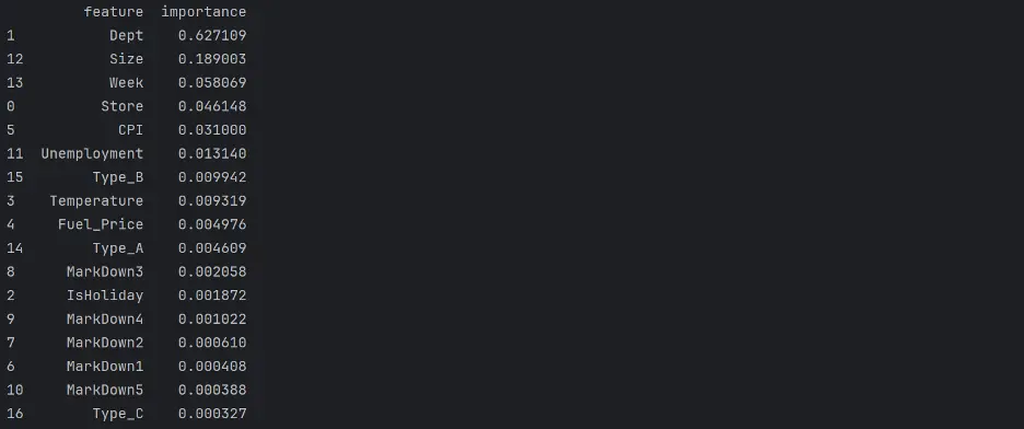
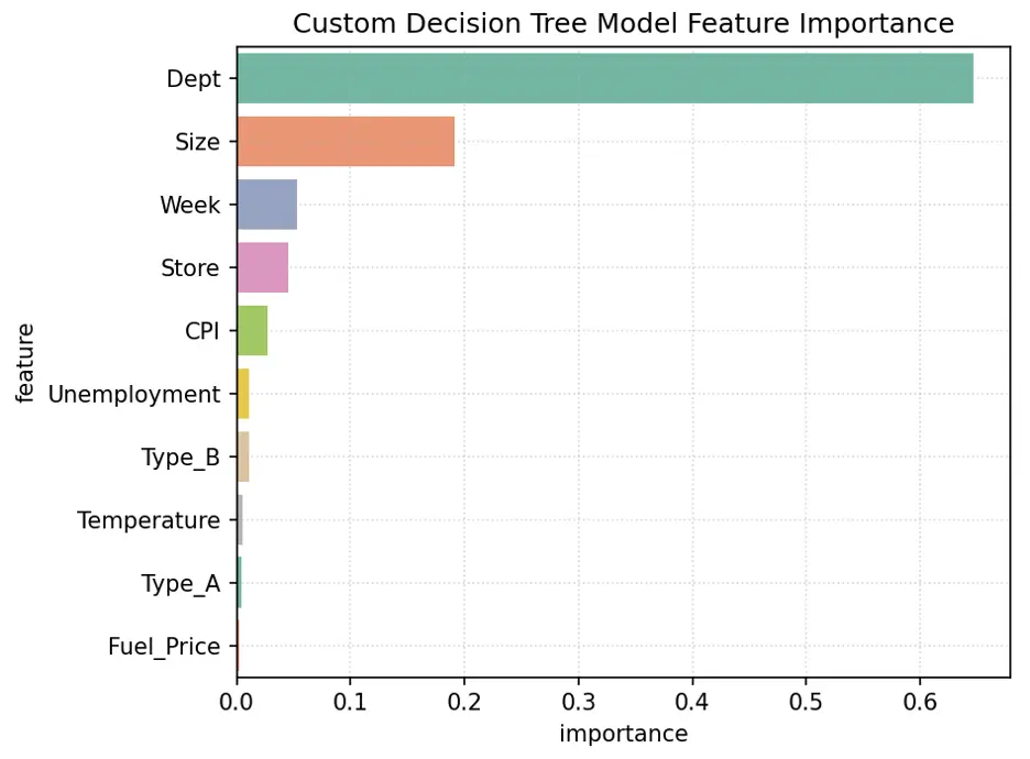
Let’s determine feature importance in the model:
# Decision Tree Feature Importance
tree2_importance_df = pd.DataFrame({'feature': train_inputs.columns, 'importance': tree2.feature_importances_}).sort_values('importance', ascending=False)
print(tree2_importance_df)
Output:
Plot the Feature Importance:
# Create Bar Chart of Weights
fig = sns.barplot(x='importance', y='feature', data=tree2_importance_df.head(10), hue='feature', palette="Set2", legend=False)
plt.grid(True, linestyle=':', alpha=0.5)
plt.title('Custom Decision Tree Model Feature Importance')
plt.tight_layout()
plt.show()
Output:
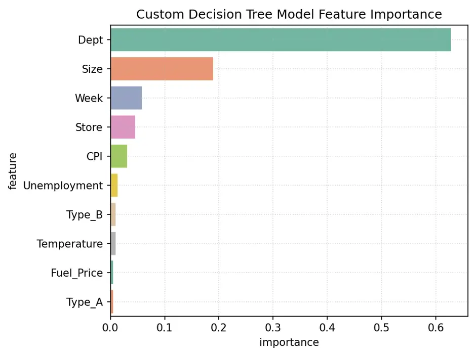
The variables Dept, Size, Week, and Store are the most important for this model.
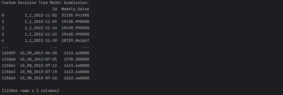
Let’s make predictions using our final model:
test_prediction1 = tree2.predict(test_inputs)
# Replace the Weekly_Sales Value with Predicted Values
submission_df['Weekly_Sales'] = test_prediction1
# Save the Weekly_Sales with Predicted Values to a CSV File
submission_df.to_csv('submission.csv', index=False)
print("Custom Decision Tree Model Submission: ")
print(submission_df)
Output:
Random Forest Regressor Model
We can tune parameters in a random forest regressor model in a similar manner to decision trees.
Here we’ll define three parameters to tune via four pytest fixtures, n_estimators, min_samples_leaf, max_leaf_nodes, and max_depth:
def test_param(**params):
    model = RandomForestRegressor(random_state=42, n_jobs=-1, **params).fit(train_inputs, train_targets)
    weights_train = train_inputs.IsHoliday.apply(lambda x: 5 if x else 1)
    weights_val = val_inputs.IsHoliday.apply(lambda x: 5 if x else 1)
    train_wmae = np.sum(np.multiply(abs(train_targets - model.predict(train_inputs)), weights_train)) / (np.sum(weights_train))
    val_wmae = np.sum(np.multiply(abs(val_targets - model.predict(val_inputs)), weights_val)) / (np.sum(weights_val))
    return train_wmae, val_wmae

@pytest.fixture(params=["n_estimators", "min_samples_leaf", "max_leaf_nodes", "max_depth"])
def param_name(request):
    return request.param

@pytest.fixture
def param_values(param_name):
    if param_name == "n_estimators":
        return [10, 15, 20, 25]
    elif param_name == "min_samples_leaf":
        return [1, 2, 3, 4, 5]
    elif param_name == "max_leaf_nodes":
        return [30, 60, 90, 120]
    elif param_name == "max_depth":
        return [5, 10, 15, 20, 25]

def test_param_and_plot2(param_name, param_values):
    train_errors, val_errors = [], []

    # Computing and Appending Errors
    for value in param_values:
        param = {param_name: value}
        train_wmae, val_wmae = test_param(**param)
        train_errors.append(train_wmae)
        val_errors.append(val_wmae)#

    # Printing Errors For Each Parameter Value
    print()
    print("Param_values:", param_values)
    print("Training_errors:", train_errors)
    print("Validation_errors:", val_errors)

    # Plot the Overfitting Curve for the Parameter
    plt.figure(figsize=(10,6))
    plt.grid()
    plt.title('Overfitting Curve: ' + param_name)
    plt.plot(param_values, train_errors, 'b-o')
    plt.plot(param_values, val_errors, 'r-o')
    plt.xlabel(param_name)
    plt.ylabel('Weighted Mean Absolute Error (WMAE)')
    plt.legend(['Training', 'Validation'])
    plt.tight_layout()
    plt.show()
Output:
n_estimators overfitting information:

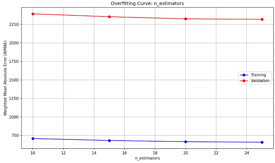
The model’s performance on unseen (validation) data decreases slightly as n_estimators approaches 20 and then remains relatively constant.
min_samples_leaf overfitting information:

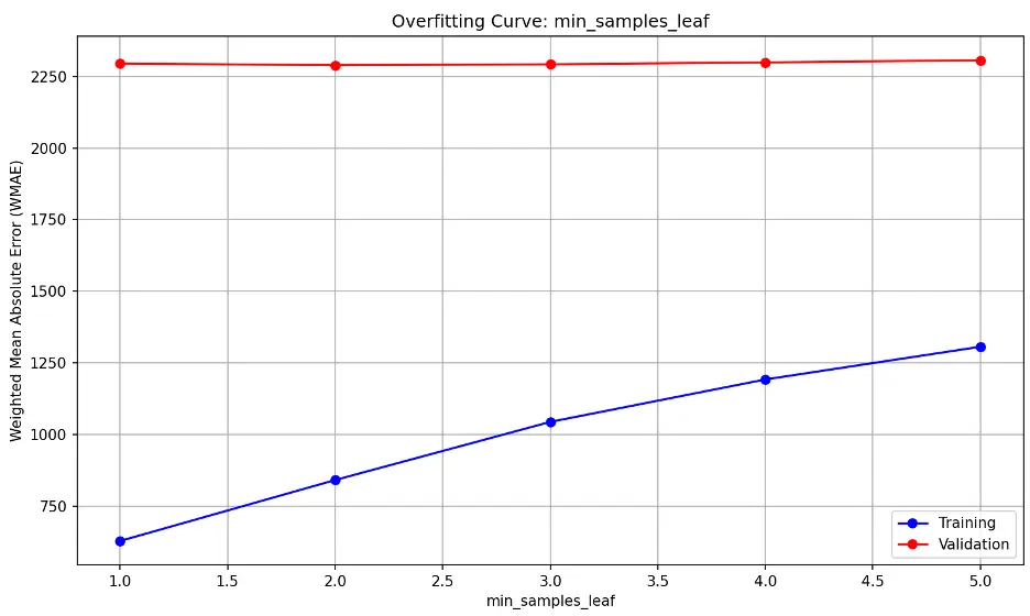
The high, flat validation line suggests that the model’s performance on unseen (validation) data is consistently not generalizing well to new data and that changing min_samples_leaf is not significantly improving the model’s performance. The upward trending training line indicates training error is increasing.
This may suggest the model is underfitting the data, as it may be too simple to capture the underlying patterns in the training and validation datasets.
max_leaf_nodes overfitting information:

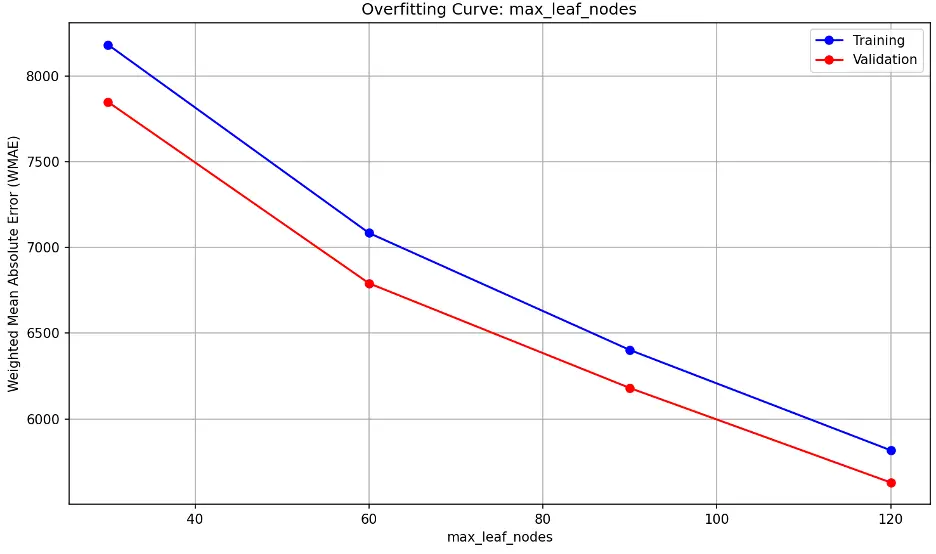
As max_leaf_nodes increases, the model becomes more complex. Divergence between training and validation errors as max_leaf_nodes increases is a sign of overfitting. We don’t see that here; we see nearly parallel decreasing error lines. This indicates that increasing max_leaf_nodes improve the model’s performance at a similar rate for both training and validation data without overfitting. It also indicates that the model may be underfitting at lower max_leaf_node values.
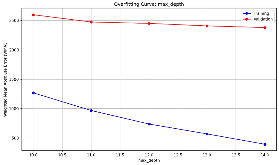
max_depth overfitting information:

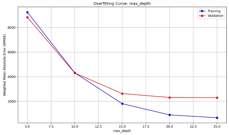
As max_depth increases, the model becomes increasingly complex. Both error lines decrease sharply until max_depth of 15, then they reduce further to 20, and then appear to level or decrease at a slower rate.
Random Forest with Custom Parameters
Based on the random forest regressor model results above, we’ll set n_estimators to 17, min_samples_leaf to 3, and max_depth to 20. We will not set max_leaf_nodes and instead allow the model to learn on its own:
# Train the Best Random Forest Model with Custom Hyperparameters
rf2 = RandomForestRegressor(n_estimators=17, min_samples_leaf = 3, max_depth = 20, random_state=42)
# Train the Model
rf2.fit(train_inputs, train_targets)
# Generate Predictions
rf2_train_preds = rf2.predict(train_inputs)
rf2_val_preds = rf2.predict(val_inputs)
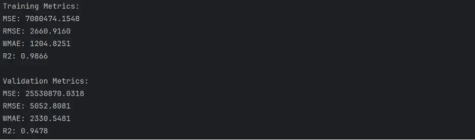
Let’s calculate the accuracy of this model:
# Calculate Accuracy of the Random Forest Model with Custom Parameters
def calculate_regression_metrics(y_true, y_pred, inputs):
    weights = inputs.IsHoliday.apply(lambda x: 5 if x else 1)

    mse = mean_squared_error(y_true, y_pred)
    rmse = np.sqrt(mse)
    wmae = weighted_mean_absolute_error(y_true, y_pred, weights)
    r2 = r2_score(y_true, y_pred)

    return {
        'MSE': mse,
        'RMSE': rmse,
        'WMAE': wmae,
        'R2': r2
    }

def weighted_mean_absolute_error(y_true, y_pred, weights):
    return np.sum(np.multiply(abs(y_true - y_pred), weights)) / np.sum(weights)

# Calculate metrics for training data
train_metrics = calculate_regression_metrics(train_targets, rf2_train_preds, train_inputs)

# Calculate metrics for validation data
val_metrics = calculate_regression_metrics(val_targets, rf2_val_preds, val_inputs)

# Print the results
print("Training Metrics:")
for metric, value in train_metrics.items():
    print(f"{metric}: {value:.4f}")

print("\nValidation Metrics:")
for metric, value in val_metrics.items():
    print(f"{metric}: {value:.4f}")
Output:
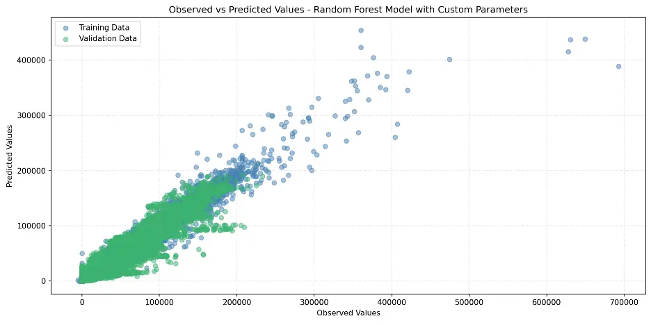
Let’s plot the observed and predicated values in a scatter plot:
# Create Scatter Plot Random Forest with Custom Hyperparameters Model
plt.figure(figsize=(12,6))
plt.scatter(train_targets, rf2_train_preds, color='steelblue', alpha=0.5, label='Training Data')
plt.scatter(val_targets, rf2_val_preds, color='mediumseagreen', alpha=0.5, label='Validation Data')
plt.xlabel('Observed Values')
plt.ylabel('Predicted Values')
plt.title('Observed vs Predicted Values - Random Forest Model with Custom Parameters')
plt.legend()
plt.grid(True, linestyle=':', alpha=0.5)
plt.tight_layout()
plt.show()
Output:
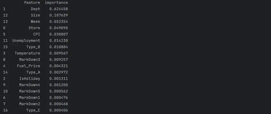
Let’s review the Random Forest Feature Importance and look at the weights assigned to different columns, to figure out which columns in the dataset are the most important for this model.
# Random Forest Feature Importance
rf2_importance_df = pd.DataFrame({'feature': train_inputs.columns, 'importance': rf2.feature_importances_}).sort_values('importance', ascending=False)
print(rf2_importance_df)
Output:
Create a bar chart of feature importance.
# Create Bar Chart of Weights
fig = sns.barplot(x='importance', y='feature', data=rf2_importance_df.head(10), hue='feature', palette="Set2", legend=False)
plt.grid(True, linestyle=':', alpha=0.5)
plt.title('Custom Random Forest Model Feature Importance')
plt.tight_layout()
plt.show()
Output:
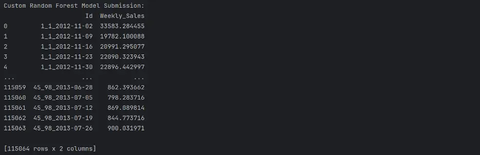
The variables Dept, Size, Week, and Store are the most importance variables in the model. Let’s now make predictions using our final model.
# Make Predictions Using Final Model
test_prediction2 = rf2.predict(test_inputs)
# Replace the Weekly_Sales Value with Predicted Values
submission_df['Weekly_Sales'] = test_prediction2
# Save the Weekly_Sales with Predicted Values to a CSV File
submission_df.to_csv('submission.csv', index=False)
print(submission_df)
Ouput:
Gradient Boost Regressor Model
We can also tune parameters in a gradient boost regressor model. Here, we’ll define three pytest fixtures to tune, n_estimators, max_depth, and learning_rate, and provide a range of values to test each parameter:
def test_param(**params):
    model = XGBRegressor(random_state = 42, n_jobs=-1, **params).fit(train_inputs, train_targets)
    weights_train = train_inputs.IsHoliday.apply(lambda x: 5 if x else 1)
    weights_val = val_inputs.IsHoliday.apply(lambda x: 5 if x else 1)
    train_wmae = np.sum(np.multiply(abs(train_targets - model.predict(train_inputs)), weights_train)) / (np.sum(weights_train))
    val_wmae = np.sum(np.multiply(abs(val_targets - model.predict(val_inputs)), weights_val)) / (np.sum(weights_val))
    return train_wmae, val_wmae

@pytest.fixture(params=["n_estimators", "max_depth", "learning_rate"])
def param_name(request):
    return request.param

@pytest.fixture
def param_values(param_name):
    if param_name == "n_estimators":
        return [30, 60, 90, 120, 150]
    elif param_name == "max_depth":
        return [10, 11, 12, 13, 14]
    elif param_name == "learning_rate":
        return [0.1, 0.2, 0.3, 0.4, 0.5]

def test_param_and_plot3(param_name, param_values):
    train_errors, val_errors = [], []

    # Computing and Appending Errors
    for value in param_values:
        param = {param_name: value}
        train_wmae, val_wmae = test_param(**param)
        train_errors.append(train_wmae)
        val_errors.append(val_wmae)

    # Printing Errors for Each Parameter Value
    print()
    print("Param_values:", param_values)
    print("Training_errors:", train_errors)
    print("Validation_errors:", val_errors)

    # Plotting the Overfitting Curve for the Parameter
    plt.figure(figsize=(10,6))
    plt.grid()
    plt.title('Overfitting Curve: ' + param_name)
    plt.plot(param_values, train_errors, 'b-o')
    plt.plot(param_values, val_errors, 'r-o')
    plt.xlabel(param_name)
    plt.ylabel('Weighted Mean Absolute Error (WMAE')
    plt.legend(['Training', 'Validation'])
    plt.tight_layout()
    plt.show()
Output:
n_estimators overfitting information:

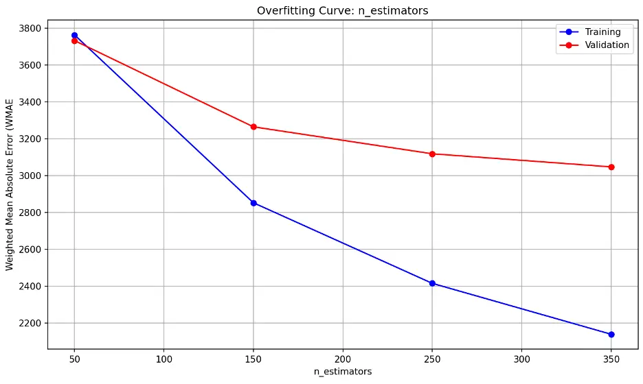
The error lines fall substantially as the n_estimators parameter increases, indicating the model’s performance on the validation dataset improves as well. The trend line suggests diminishing returns may begin after 350, suggesting that the model is not overfitting as more estimators are added through this point.
max_depth overfitting information:

learning_rate overfitting information:

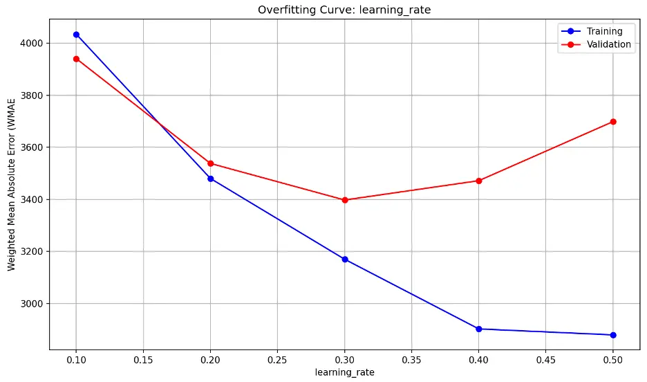
Validation error decreases substantially through a learning_rate value of 0.2, then decreases slightly as learning_rate approaches 0.3, and increases sharply thereafter. This indicates that the model may be underfitting the data at low values and overfitting at higher values The model also appears to be sensitive to learning_rate, suggesting small changes may have a large impact on model performance. Lower learning_rate values tend to result in slower but more precise learning while higher rates tend to result in faster but less stable learning.
Gradient Boost with Custom Parameters
Based on the gradient boost regressor model results, we’ll set n_estimators to 300, max_depth to 13 , and learning_rate to 0.2 to train a new model:
# Train the New Gradient Boost Model
gb2 = XGBRegressor(n_estimators = 300, max_depth = 13, random_state = 42, n_jobs = -1)
gb2.fit(train_inputs, train_targets)
# Make Predictions Using the New Gradient Boost Model
gb2_train_preds = gb2.predict(train_inputs)
gb2_val_preds = gb2.predict(val_inputs)
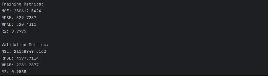
Calculate Accuracy
# Calculate Accuracy of the Gradient Boost Model with Custom Parameters
def calculate_regression_metrics(y_true, y_pred, inputs):
    weights = inputs.IsHoliday.apply(lambda x: 5 if x else 1)

    mse = mean_squared_error(y_true, y_pred)
    rmse = np.sqrt(mse)
    wmae = weighted_mean_absolute_error(y_true, y_pred, weights)
    r2 = r2_score(y_true, y_pred)

    return {
        'MSE': mse,
        'RMSE': rmse,
        'WMAE': wmae,
        'R2': r2
    }

def weighted_mean_absolute_error(y_true, y_pred, weights):
    return np.sum(np.multiply(abs(y_true - y_pred), weights)) / np.sum(weights)

# Calculate metrics for training data
train_metrics = calculate_regression_metrics(train_targets, gb2_train_preds, train_inputs)

# Calculate metrics for validation data
val_metrics = calculate_regression_metrics(val_targets, gb2_val_preds, val_inputs)

# Print the results
print("Training Metrics:")
for metric, value in train_metrics.items():
    print(f"{metric}: {value:.4f}")

print("\nValidation Metrics:")
for metric, value in val_metrics.items():
    print(f"{metric}: {value:.4f}")
Output:
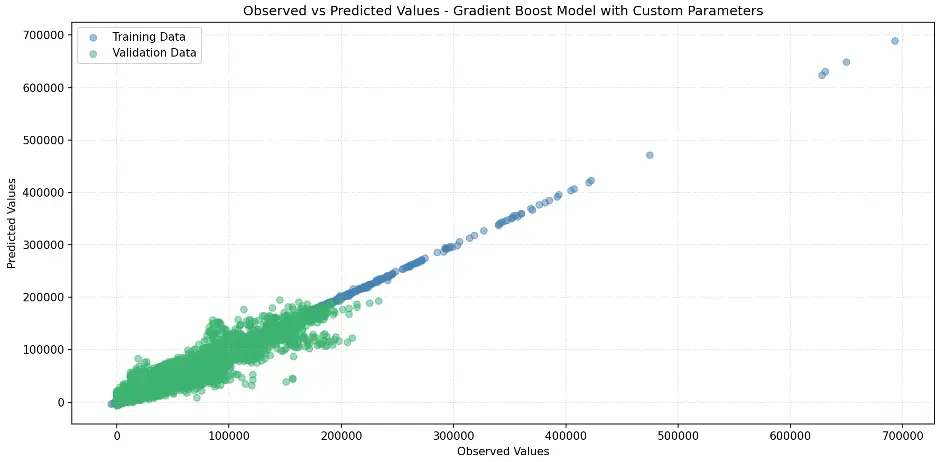
Create Scatter Plot Gradient Boost Model with Custom Parameters
# Create Scatter Plot Between Observed and Predicted Values
plt.figure(figsize=(12,6))
plt.scatter(train_targets, gb2_train_preds, color='steelblue', alpha=0.5, label='Training Data')
plt.scatter(val_targets, gb2_val_preds, color='mediumseagreen', alpha=0.5, label='Validation Data')
plt.xlabel('Observed Values')
plt.ylabel('Predicted Values')
plt.title('Observed vs Predicted Values - Gradient Boost Model with Custom Parameters')
plt.legend()
plt.grid(True, linestyle=':', alpha=0.5)
plt.tight_layout()
plt.show()
Output:
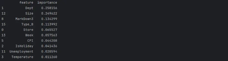
Let’s review Gradient Boost with Custom Parameters Feature Importance.
# Gradient Boost Feature Importance
gb2_importance_df = pd.DataFrame({'feature': train_inputs.columns, 'importance': gb2.feature_importances_}).sort_values('importance', ascending=False)
print(gb2_importance_df)
Output:
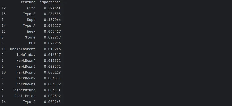
Let’s create a bar chart of feature importance.
# Create Bar Chart of Weights
fig = sns.barplot(x='importance', y='feature', data=gb2_importance_df.head(10), hue='feature', palette="Set2", legend=False)
plt.grid(True, linestyle=':', alpha=0.5)
plt.title('Custom Gradient Model Feature Importance')
plt.tight_layout()
plt.show()
Output:
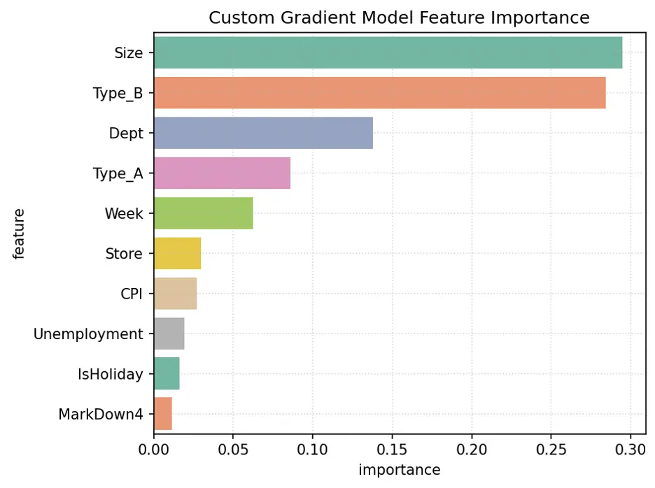
The variables Size, Type_B, Dept, Week, and Type_A are the most important for this model.
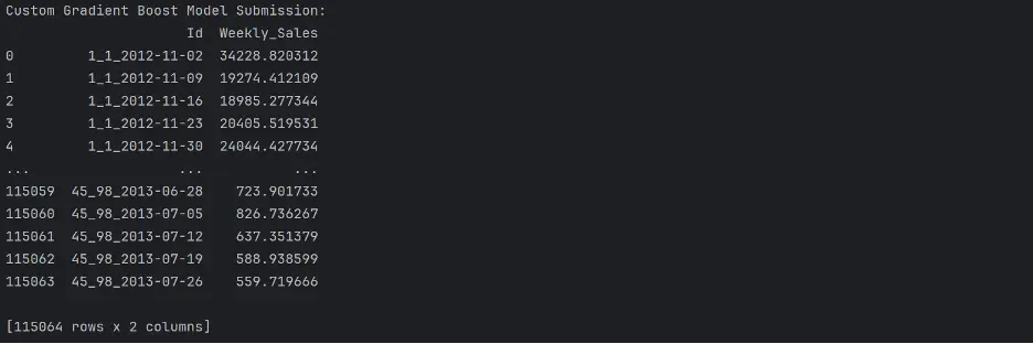
Let’s use the gradient boost regressor model to make predictions using the test dataset:
# Make Predictions Using Final Model
test_prediction3 = gb2.predict(test_inputs)
# Replace the Weekly_Sales Value with Predicted Values
submission_df['Weekly_Sales'] = test_prediction3
# Save the Weekly_Sales with Predicted Values to a CSV File
submission_df.to_csv('submission.csv', index=False)
print(submission_df)
Output:
5. Performance of the Best Model
The following table shows the WMAE results for each of our models:
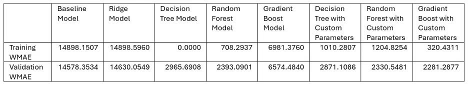
And the winner is. . . Gradient Boosting with Custom Parameters!
The champion proved its metal outperforming the competition in our sales forecasting showdown. The algorithm’s strength lies in its ability to learn from its missteps, continuously refining its strategy with each iteration. By combining the insights of several “weak learners,” Gradient Boosting created a powerhouse predictor that left rival models in the dust. Sometimes the best way to solve a problem, as the adage goes, is to break it down into smaller pieces and tackle them one at a time.
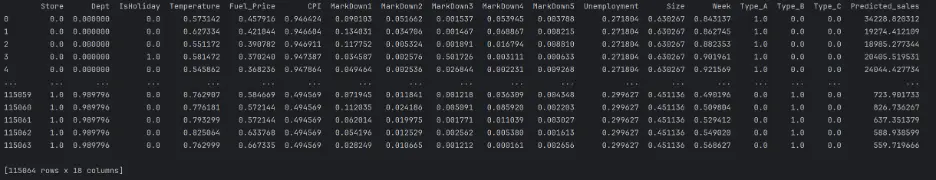
Let’s predict sales on the test dataset using the final Gradient Boosting model:
# Predict Sales Using the Gradient Boost Model with Custom Parameters
test_inputs['Predicted_sales'] = gb2.predict(test_inputs)
print(test_inputs)
Output:
6. Potential Future Work
- Remove outliers.
- Tune additional hyperparameters.
- Test other machine learning regression models and evaluate how they perform.